Publication Design:
The Unfair Sex—
Australia's Gender Pay Gap
IDA INTERNATIONAL DESIGN AWARDS 2025:
Silver Winner:
Print—Print Editorial
AGDA DESIGN AWARDS 2025:
Finalist:
Student Print and Publications—Entire Book
DNA PARIS DESIGN AWARDS 2025:
Honourable Mention:
Graphic Design—Communication Design
Graphic Design—Print Advertising
C2A CREATIVE COMMUNICATION AWARD 2024:
Winner:
Social Responsibility—Social Responsibility Focus
Other Print—Magazines, Newspapers, Calendars
LICC LONDON INTERNATIONAL CREATIVE COMPETITION 2024:
Finalist:
Illustrate (Graphic)
Shortlisted:
Illustrate (Graphic)—Poster and Small Print
Illustrate (Graphic)—Print Advertising Campaign
Illustrate (Graphic)—Other
What frankreative made: 36 page A4 and 16 page A3 printed publications
What frankreative did: Research into sociocultural context, Design Conception, Typesetting, Expressive Typography, Photography, Photo Manipulation, Brand Identity Design, Art Direction
Client: Swinburne University of Technology Assignment, 2024
The Brief: Aimed at a design-aware audience, this printed publication was required to be imaginative, complex and expressive relating to a topic of design activism. Through research into a chosen direction, a cohesive visual language was required to be developed to communicate a strongly individual outcome.
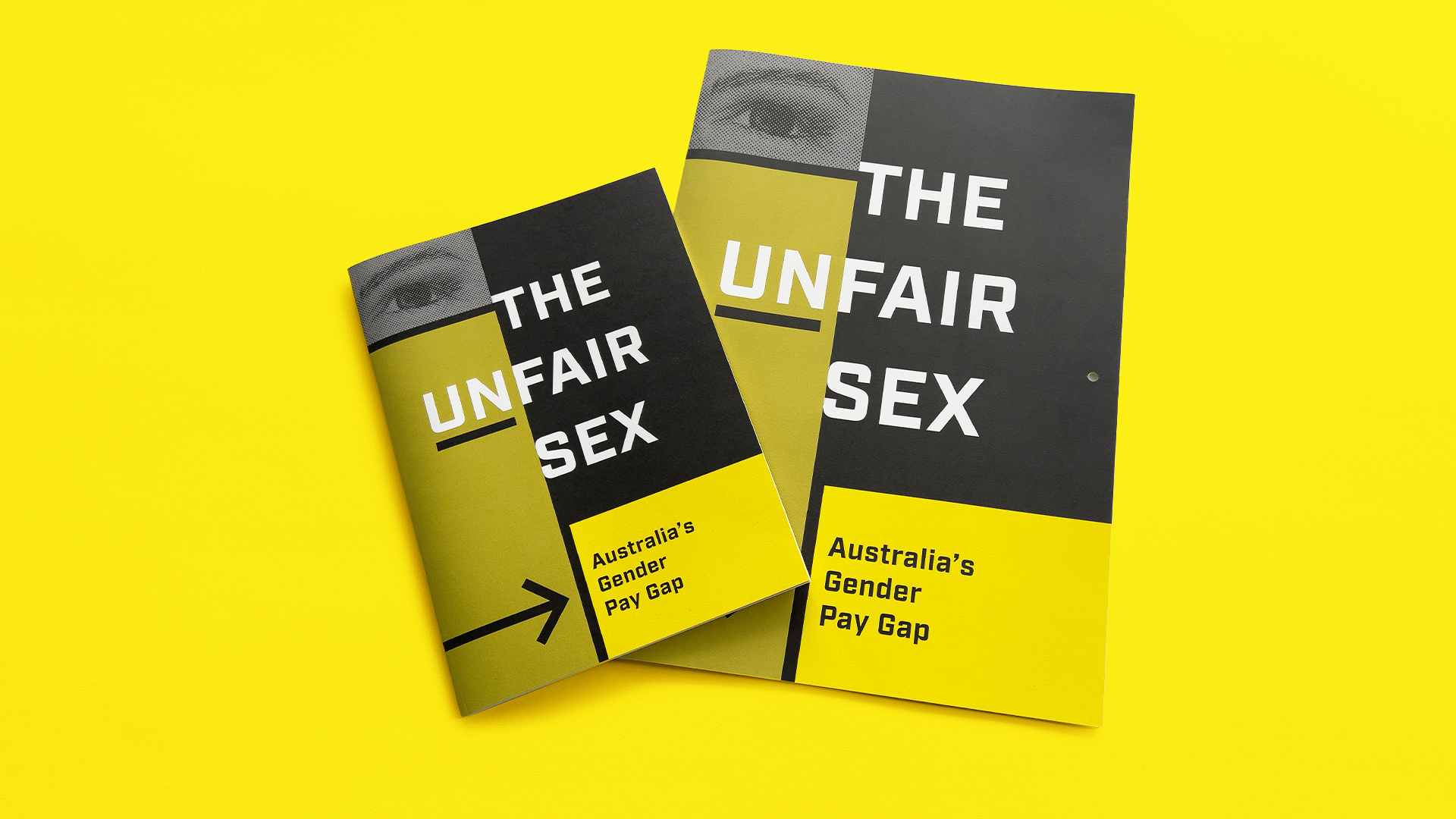
The Unfair Sex Twin Publications: Offering a absorbing long-form reading, the A4 printed publication works in unison with the A3 giant-scale publication. The latter is full of large-size poster-spreads, and is designed to be hung on the wall for maximum impact to prompt thought on Australia’s gender pay gap.
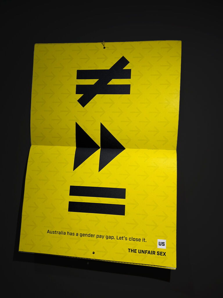
Strong Symbolism: Set upon dramatically contrasting colour and repeated arrow motifs communicating the need for progression towards positive change, this A3 spread hanging on the wall as a poster uses simple symbols to crystallise the problem faced by women and their families due to Australia’s gender pay gap.
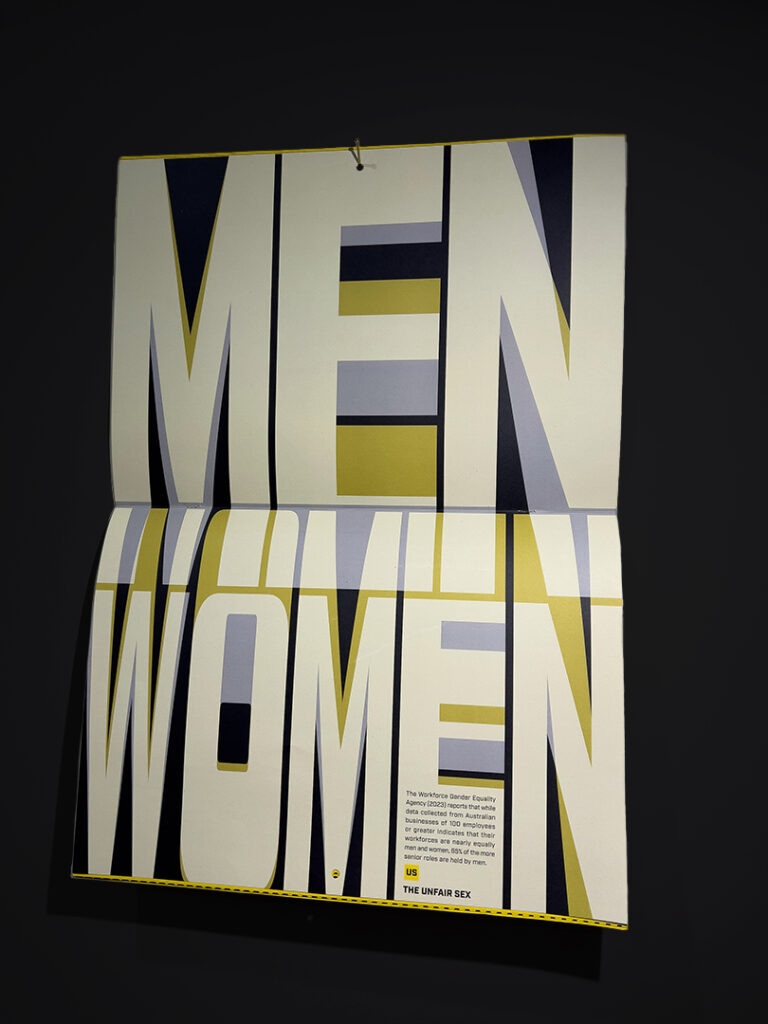
Expressive Typography: This jumbo-sized A3 poster spread hangs on the wall and displays overlaying exaggerated typeforms set in varying opacity levels expressing the imbalance of men holding senior roles—despite men and women being represented equally in the Australian workforce.
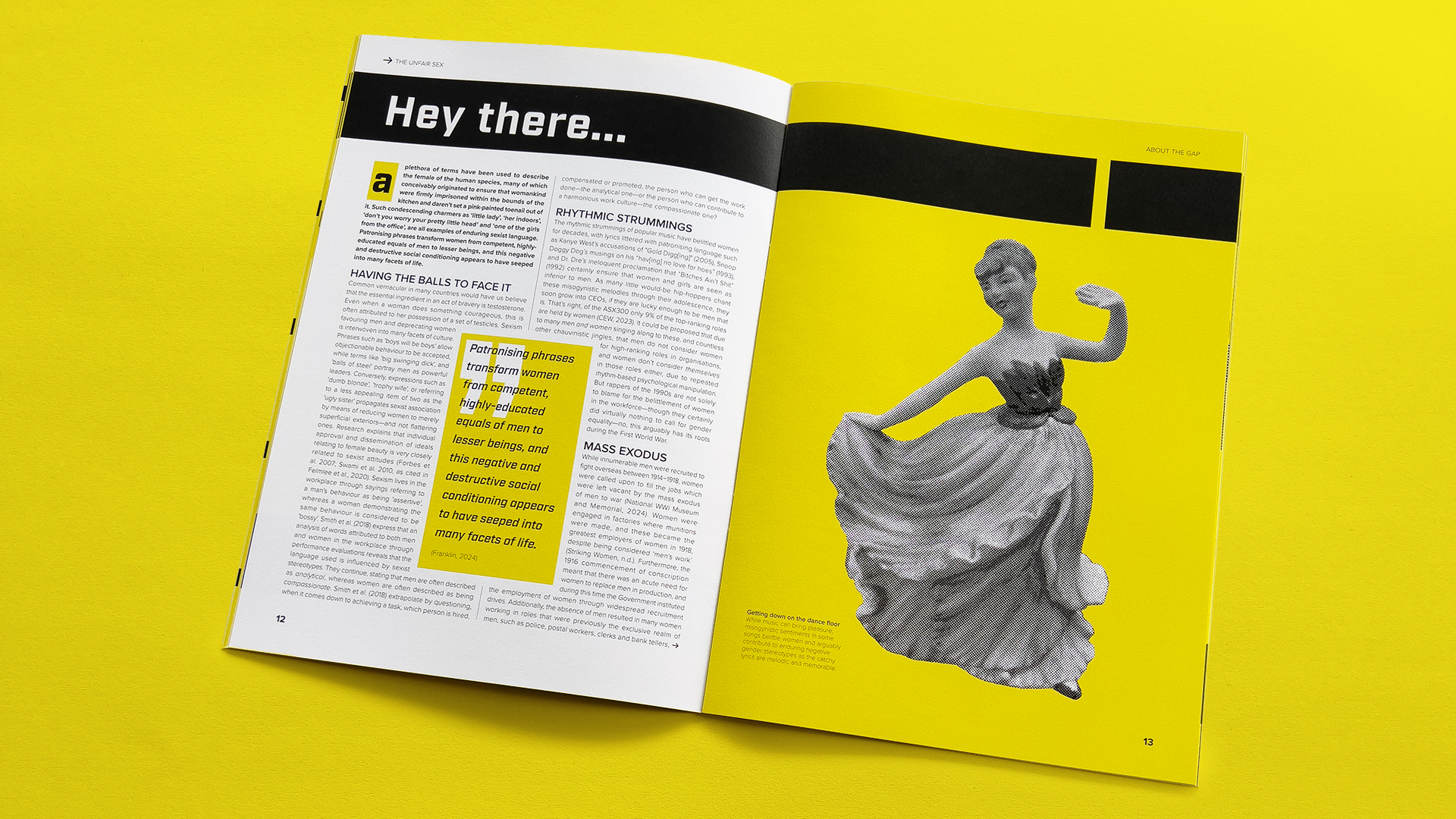
Hey There Little Lady: Judicious justification and rigorous attention to detail delivers long-form text neatly set with clear typographic hierarchy in this spread from the A4 inner publication.
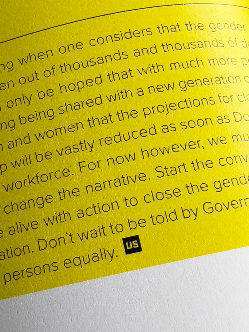
End Mark: The brand identity of the twin publications—serendipitously spelling the word ‘Us’ formed a perfect custom end mark to stylistically signal the discontinuation of a passage of text and reinforce the concepts relating to the issue.
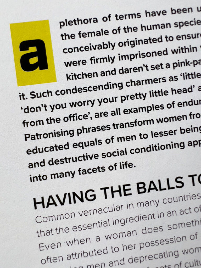
Typographic Treatments: Custom coloured decorative drop-cap details in combination with dramatically set first paragraphs guide the eye to the start of the article, while considered typographic hierarchy establishes individual bodies within the text.
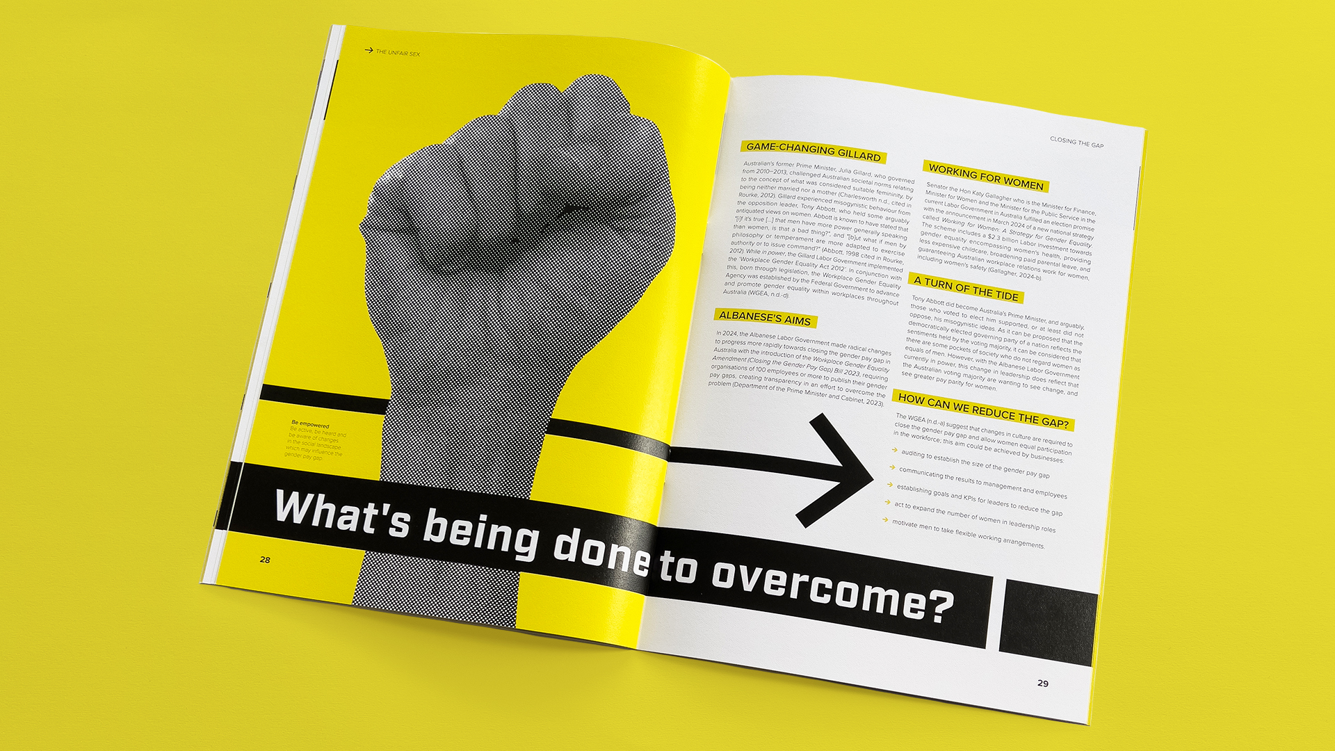
Striking Style: Carefully curated typesetting in combination with considered use of original photography and repeated arrow motifs deliver a powerful message on Australia’s gender pay gap.
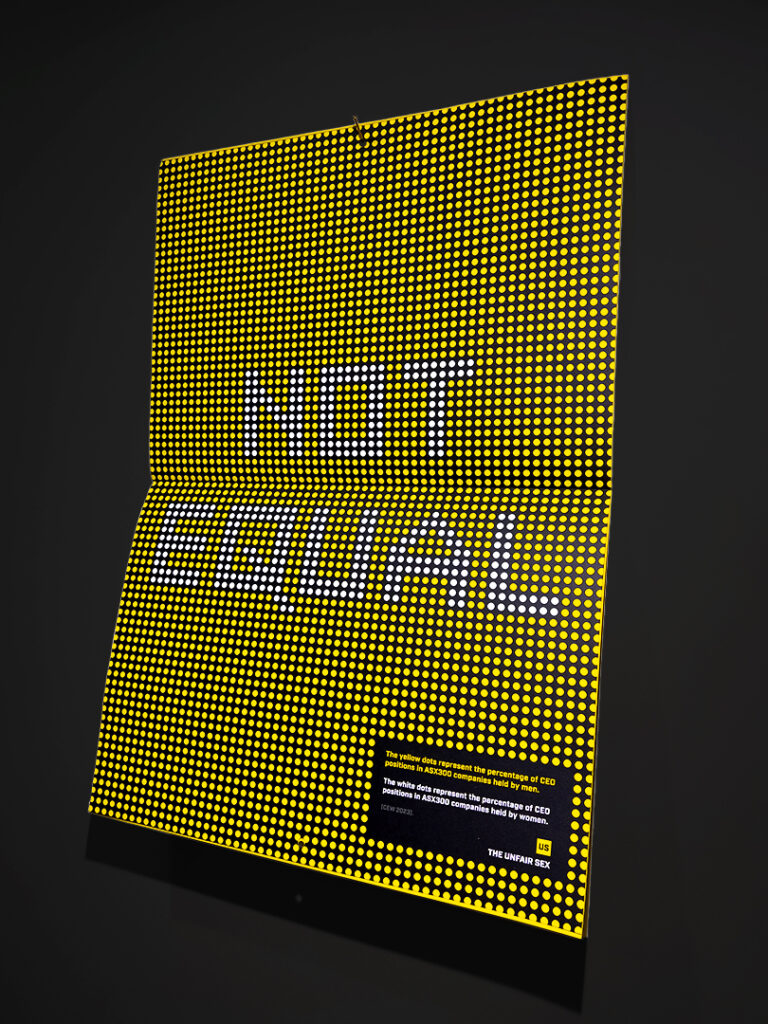
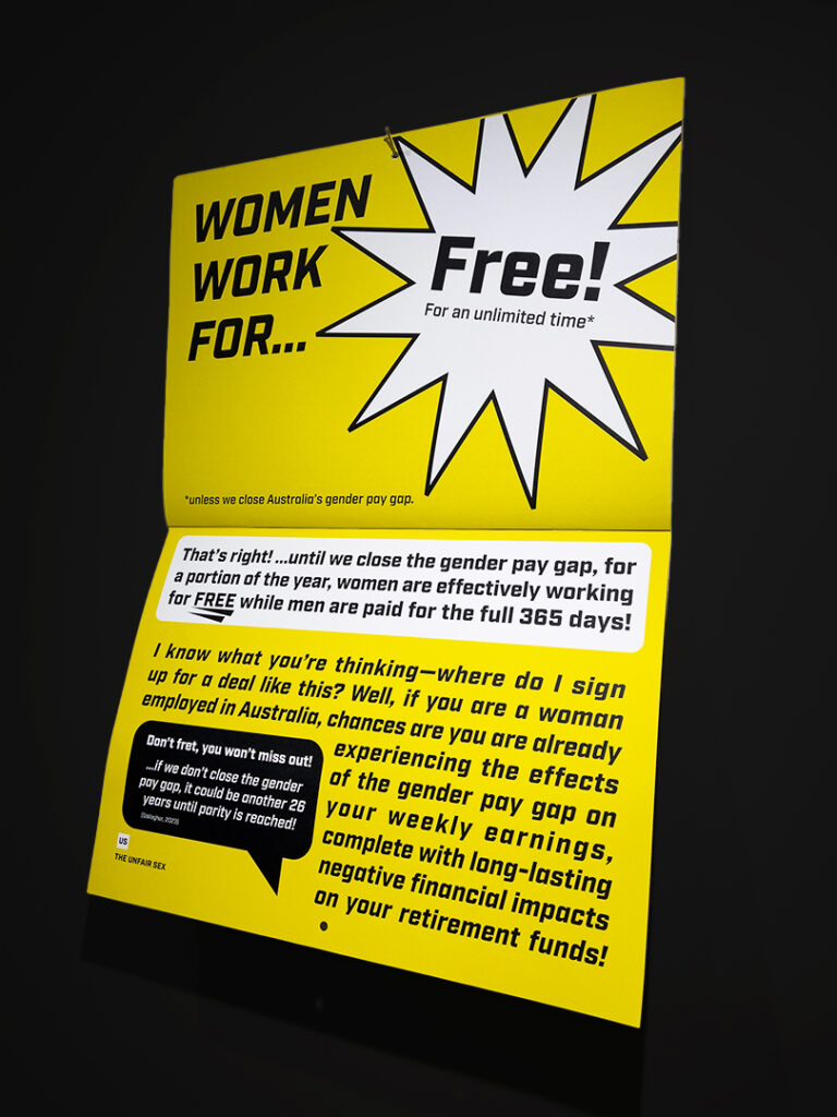
Data Visualisation: This dazzling A3 wall-hanging uses a cleverly conceived visual representation of facts surrounding the issue of Australia’s gender pay gap employing deftly devised dots revealing a pointed message about the disparity.
Intentionally Unsightly: Deliberately typeset to mimic the exaggerated claims made in some inexpensive advertising, this eye-catching A3 wall-hanging design prompts thought about how Australia’s gender pay gap negatively affects women beyond their working lives.
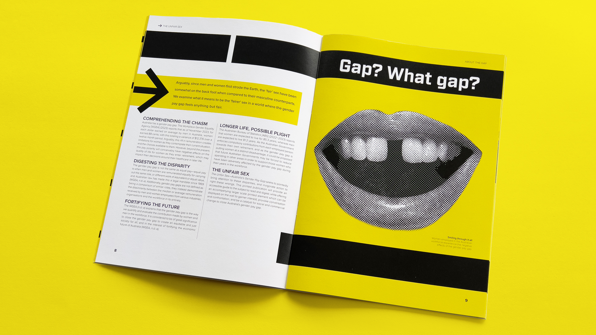
A Gaping Gap: Dynamic use of graphic devices guide the eye around the spread and clear typographic hierarchy delivers easy navigation. Compelling original photography and considered heading copy creates engaging material for readers.
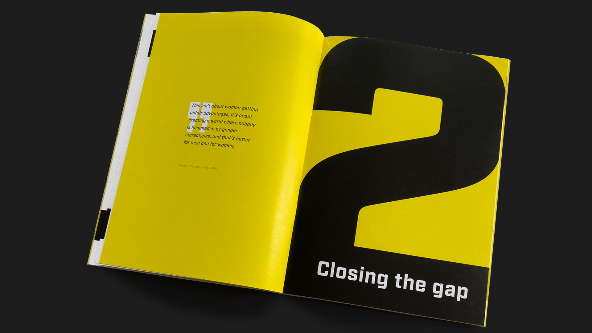
Section Division Strives for Unity: The design of this spread speaks to the sense of division relating to Australia’s gender pay gap, and a pull quote from Julia Gillard defines the next phase of the publication.
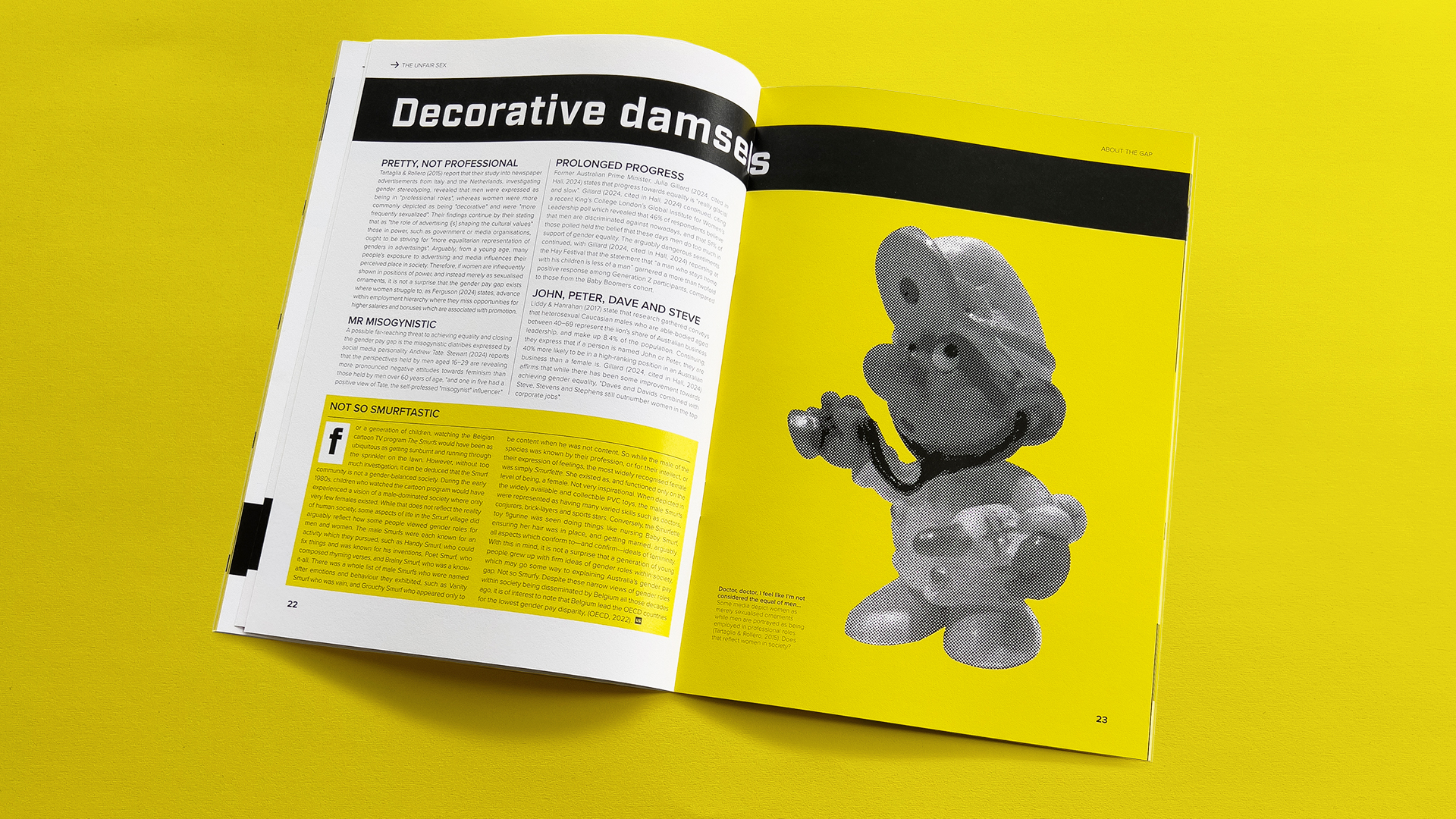
Magazine Styling: Research into the conventions of typesetting for magazine publications produced a familiar structure which was unturned by bold colour and dramatic original photography.
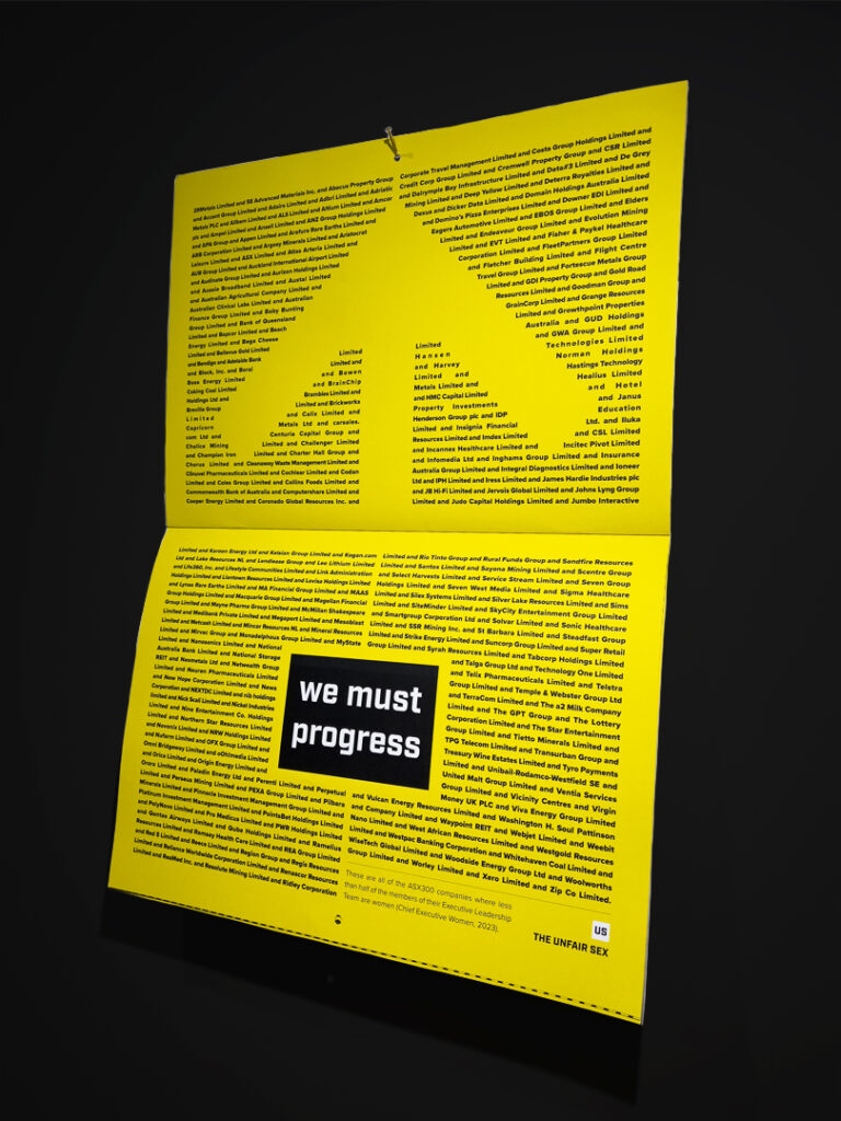
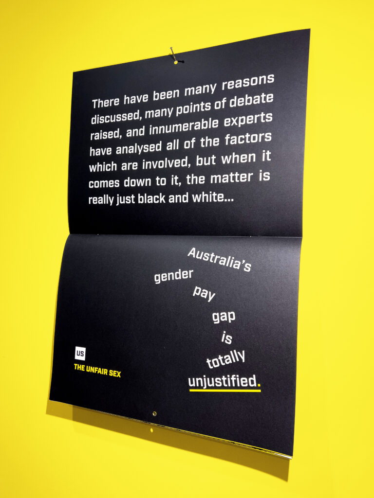
Just Justification: Carefully typeset list of data relating to the underrepresentation of women in senior roles, demonstrating research relating to Australia’s gender pay gap.
Subverting Typographic Conventions: This A3 spread hanging on the wall as a poster uses typographic conventions—and lack thereof—to communicate the problem of Australia’s gender pay gap.
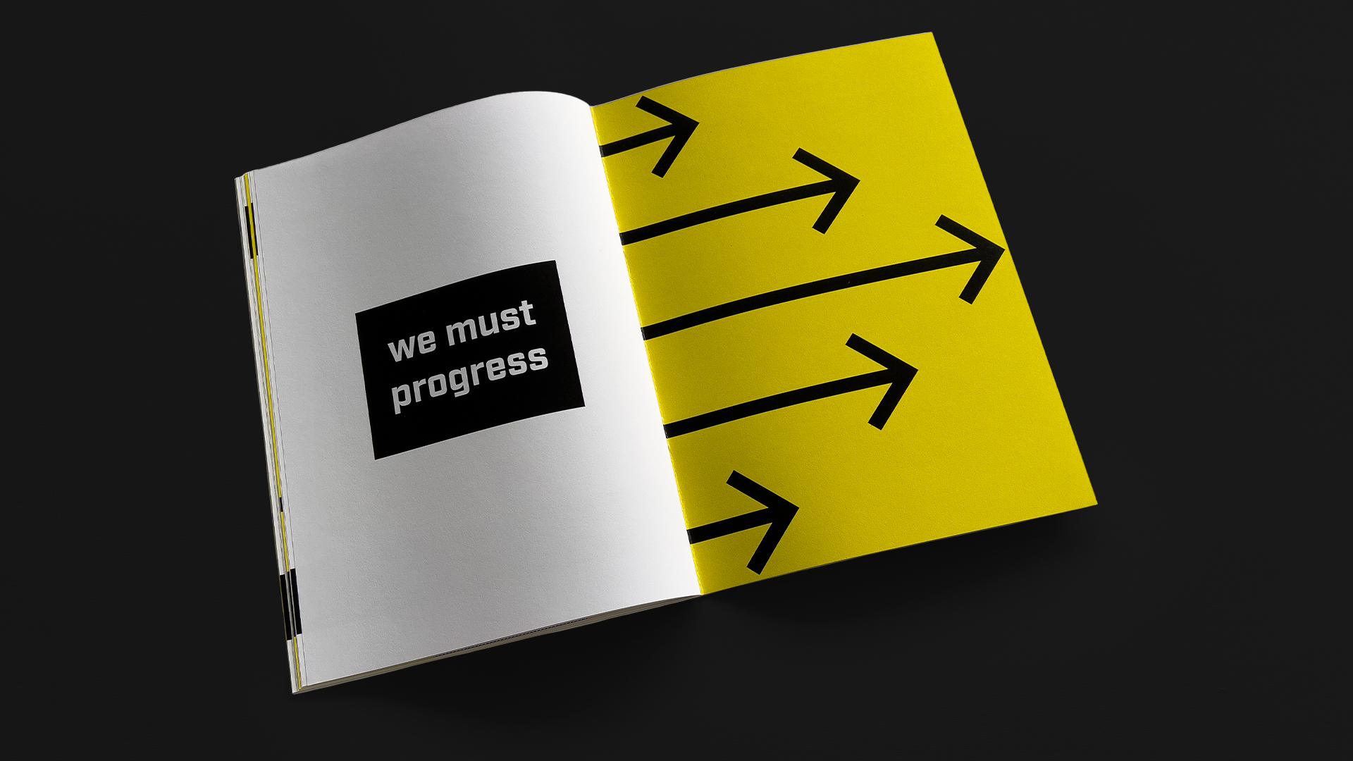
Inside Back Cover: Continuing the arrow visual motif—symbolising positive progression—seen throughout the twin publications, the inside back cover bears a dramatic message reinforcing the need for advantageous advancement.
