Publication Design:
Move It! Bop-tastic Melbourne Art Walk
IDA INTERNATIONAL DESIGN AWARDS 2025:
Honourable Mention:
Print—Print Editorial
C2A CREATIVE COMMUNICATION AWARD 2025:
Winner:
Books—Art and Culture Books
DNA PARIS DESIGN AWARDS 2025:
Winner:
Graphic Design—Print Advertising

What frankreative made: 32 page, A5 publication
What frankreative did: Typesetting, Design Conception, Photography, Document Design, Brand Identity Design, Art Direction
Client: Swinburne University of Technology Assignment, 2021
The Brief: The brief called for an innovative and original concept for a tourist guide to convey an aspect of local tourism to a domestic tourism market.
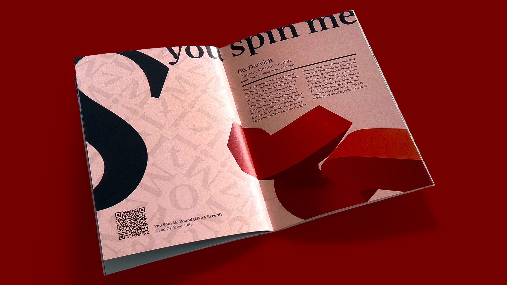
Harmonious Interactions: With deep connection to the subject matter, clever relationships are made between the sculpture and the typeforms, delivering richer communication.
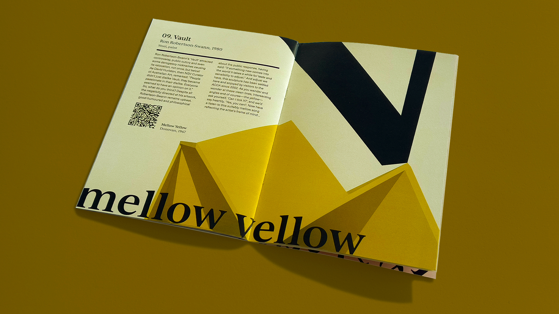
Tension Builds: Teetering typographic elements create dramatic tension in this spread reflecting the community response to artist Ron Robertson-Swann’s 1980 work.
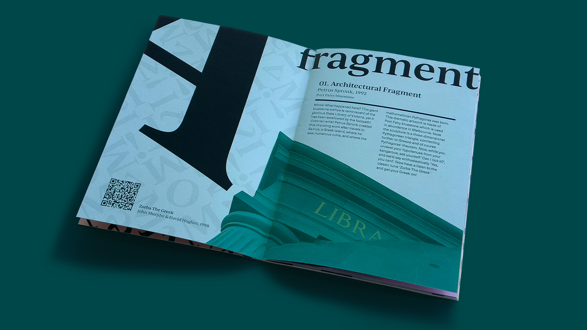
Angular Action: Capitalising on the unusual form of the Petrus Spronk artwork, the type elements carve an engaging diagonal line across the spread.
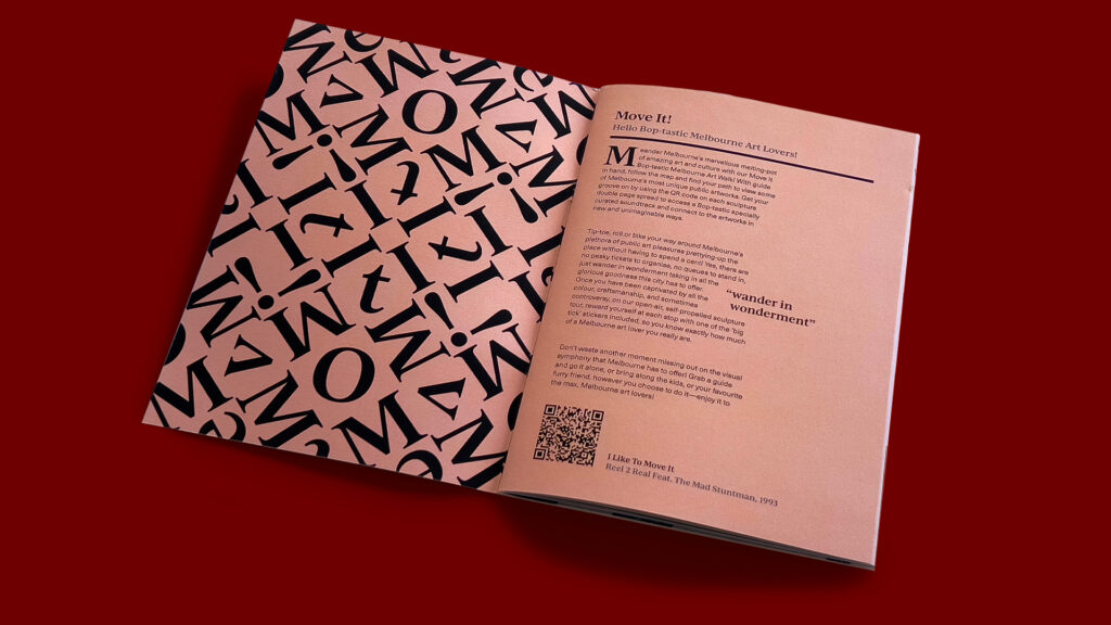
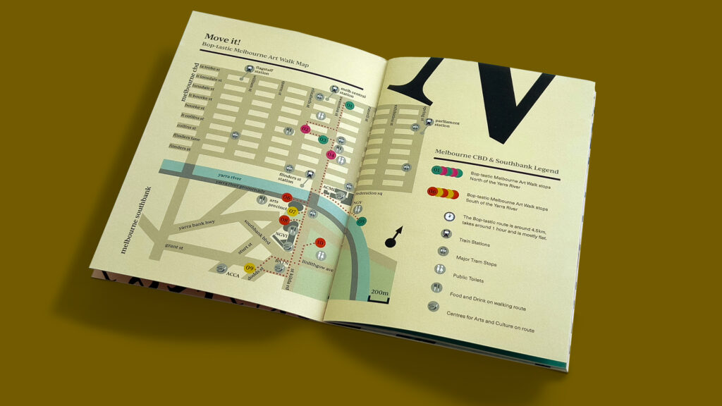
Typographic Forms as Pattern: Continuing the striking use of type as seen throughout the publication, the inside covers are adorned with a stunning all-over pattern spelling the tourist guide brandname.
Mapping the Movements: Colour coding and considered map design deliver an easy-to-use plan of the Move It! Boptastic Melbourne Art Walk.
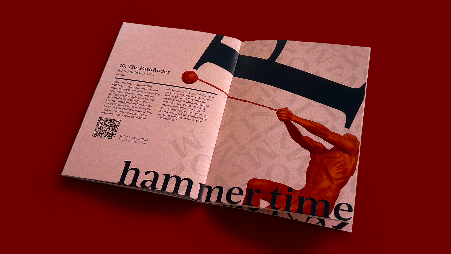
Hold On Tight: The careful placement of type elements adds emphasis the strain the sculptor has captured creating an engaging image to locate on the Art Walk.
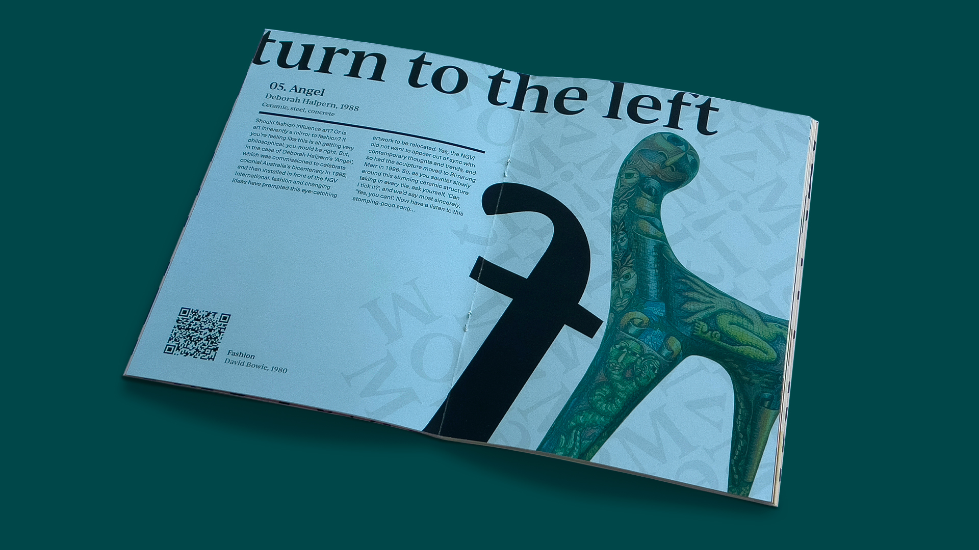
Pleasing Forms: Thoughtful engagement with the subject matter and considered use of shape delivers rhythmic spread.
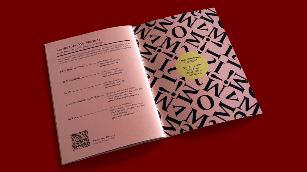
Making It To The End: Mirroring the inside front cover design, the back offers a congratulatory message and a list of more art galleries in the area for art-lovers keen to keep on exploring Melbourne’s artistic bounty.
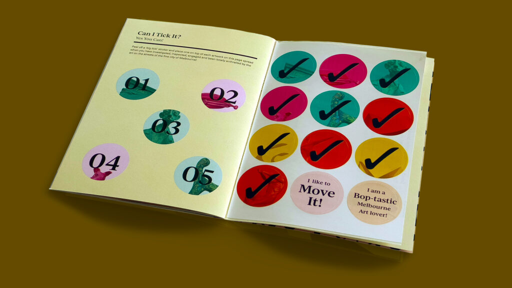
Can I Tick It? Yes You Can!: A unique and original take on a tourist guide, the Move It! Boptastic Melbourne Art Walk is interwoven with music which relates to each artwork and upon engaging with each, a sticker can be applied to the guide towards achieving the goal of completion.
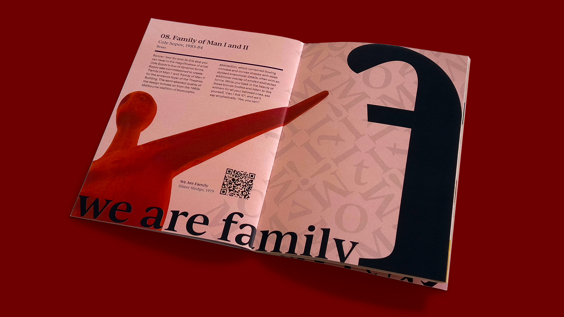
Reach Out: Capitalising on the form of the sculpture and the shape of the letterform, a dynamic spread invites readers to explore the engaging artwork.
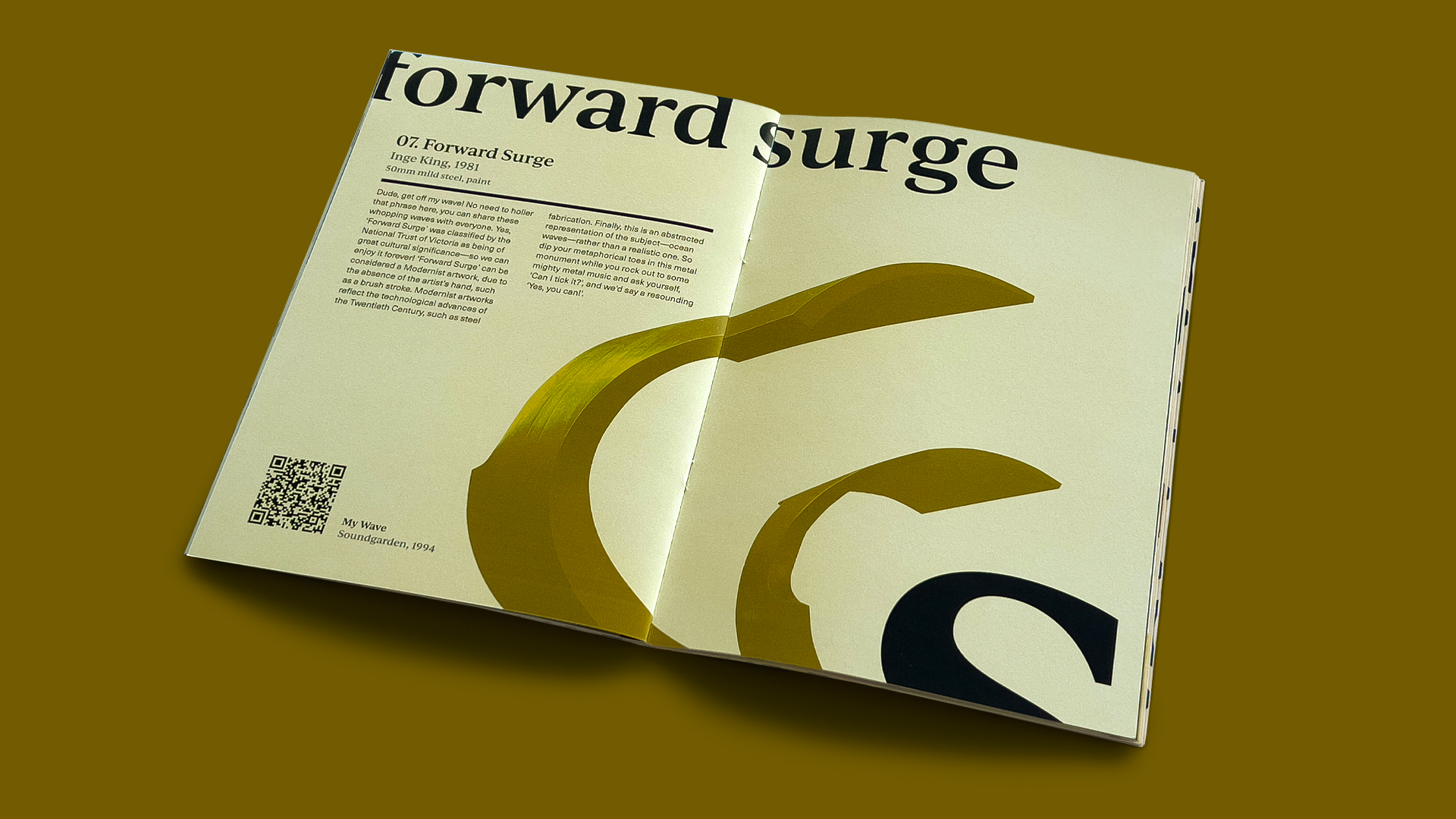
Expressive Typeforms: Full of energy, and dynamic rhythm, this spread capitalises on the sculptural forms and invites the reader to see letterforms through the same artistic lens.
