Packaging Design:
Luxe Box—Intimate Pleasure Collection
IDA INTERNATIONAL DESIGN AWARDS 2025:
Bronze Winner:
Packaging—Beauty/Health Packaging
C2A CREATIVE COMMUNICATION AWARD 2024:
Honourable Mention:
Packaging—Beauty and Health
What frankreative made: A trio of die cut boxes, 83mm x 135mm x 51mm, 300gsm, and an A3 double-sided informational sheet
What frankreative did: Research into sociocultural context, Design Conception, Surface Graphic Design, Brand Identity Design, Typesetting, Art Direction
Client: Swinburne University of Technology Assignment, 2024
The Brief: The series of box designs were to exploit the three-dimensional form in an original and compelling way. A brand identity and three unique surface graphics designs were required to garner attention for a trio of branded boutique products and extend beyond the expected to showcase creativity.
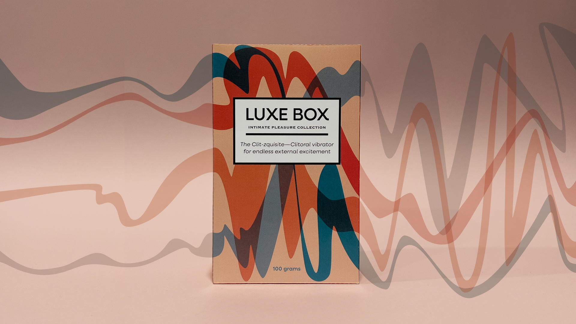
The Clit-zquisite: Luxe Box is a luxury and aspirational approach to sexual wellness, inviting women aged between 25–35 to explore their bodies and embrace how they look while feeling accepted, loved and empowered, knowing they are indulging themselves by choosing the best of the best in this market sector.
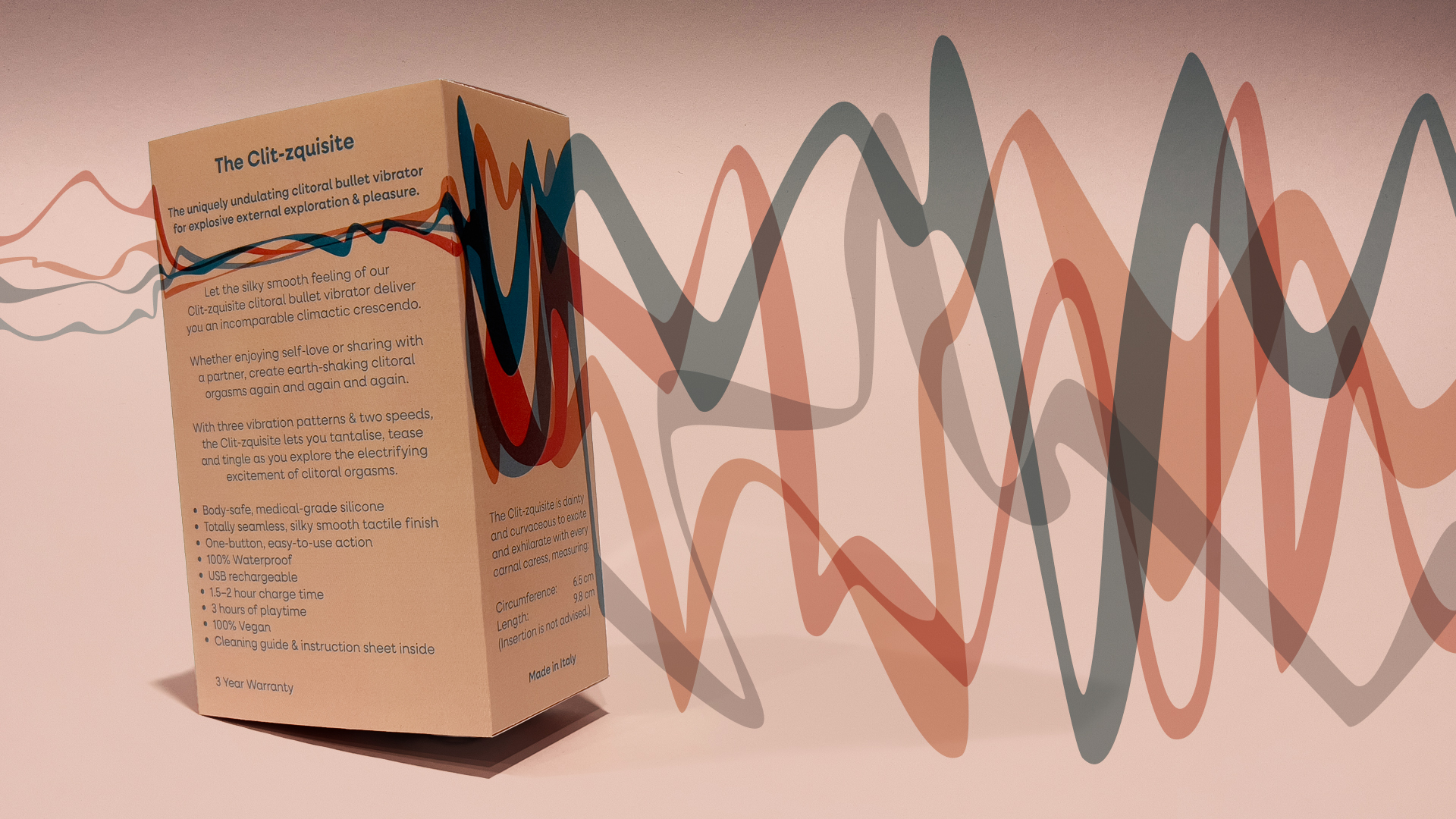
Printed to Perfection: Carefully considered print specifications were devised to communicate with the print company, with all instructions and details clearly supplied to ensure perfectly printed finished articles.
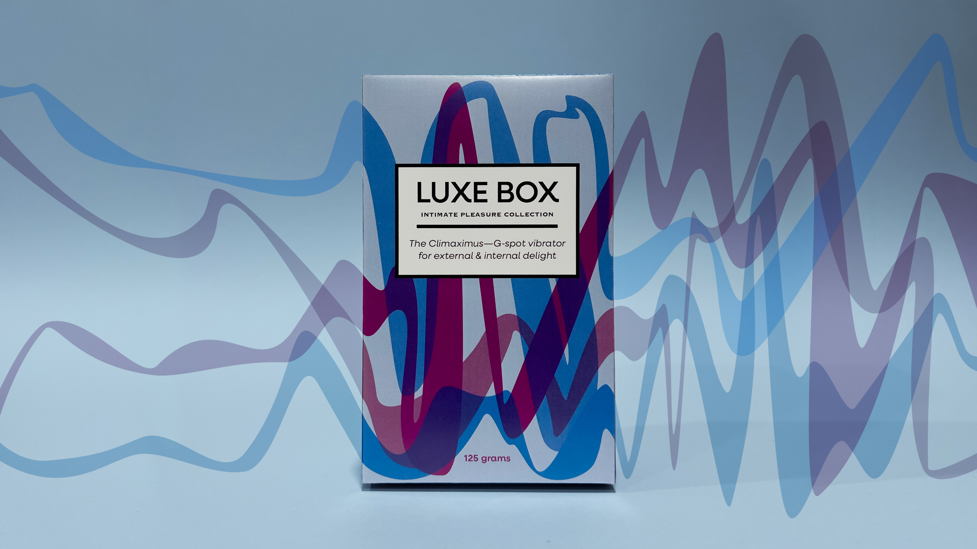
The Climaximus: By marketing Luxe Box, with the tagline Intimate Pleasure Collection, the use of the word ‘collection’ creates associations to high fashion designer labels, and conjures notions of limited edition goods, which become must-haves to an demographic who always strive to keep up with the Joneses, the Stallions or the Lizzos.
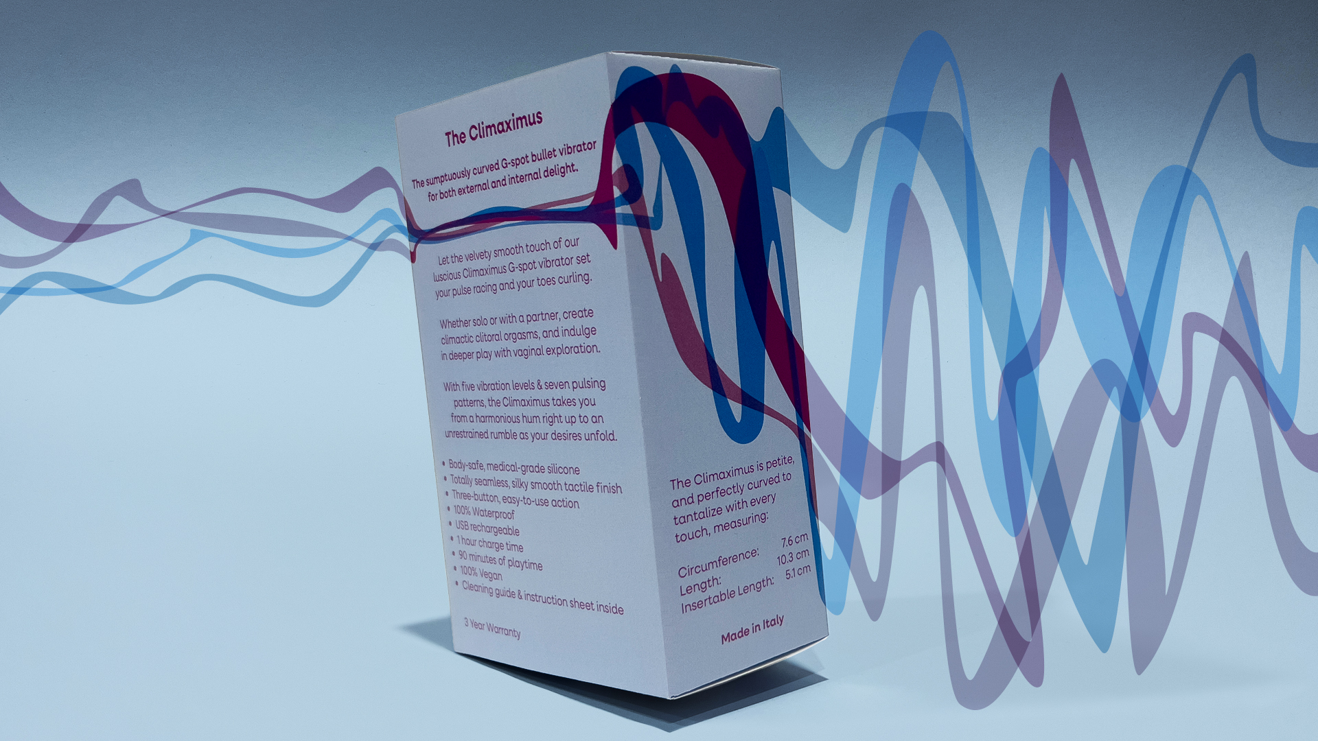
Electrifying Excitement: The considered approach to the design of the surface graphics capitalises on the overprint effect, creating a ‘vibrating’ visual result, communicating the transformative effect of the products inside each box.
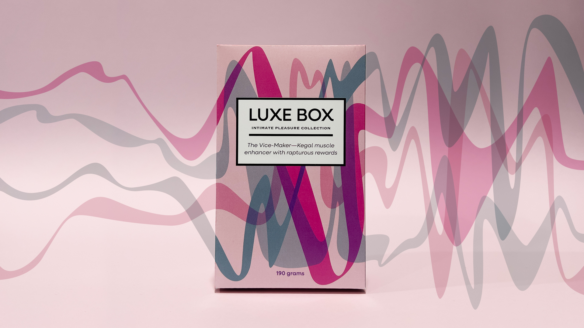
The Vice-Maker: Subtle visual communication cues indicate connections to luxury goods, with typographic elements sensitvely styled to reference high-end fashion branding.
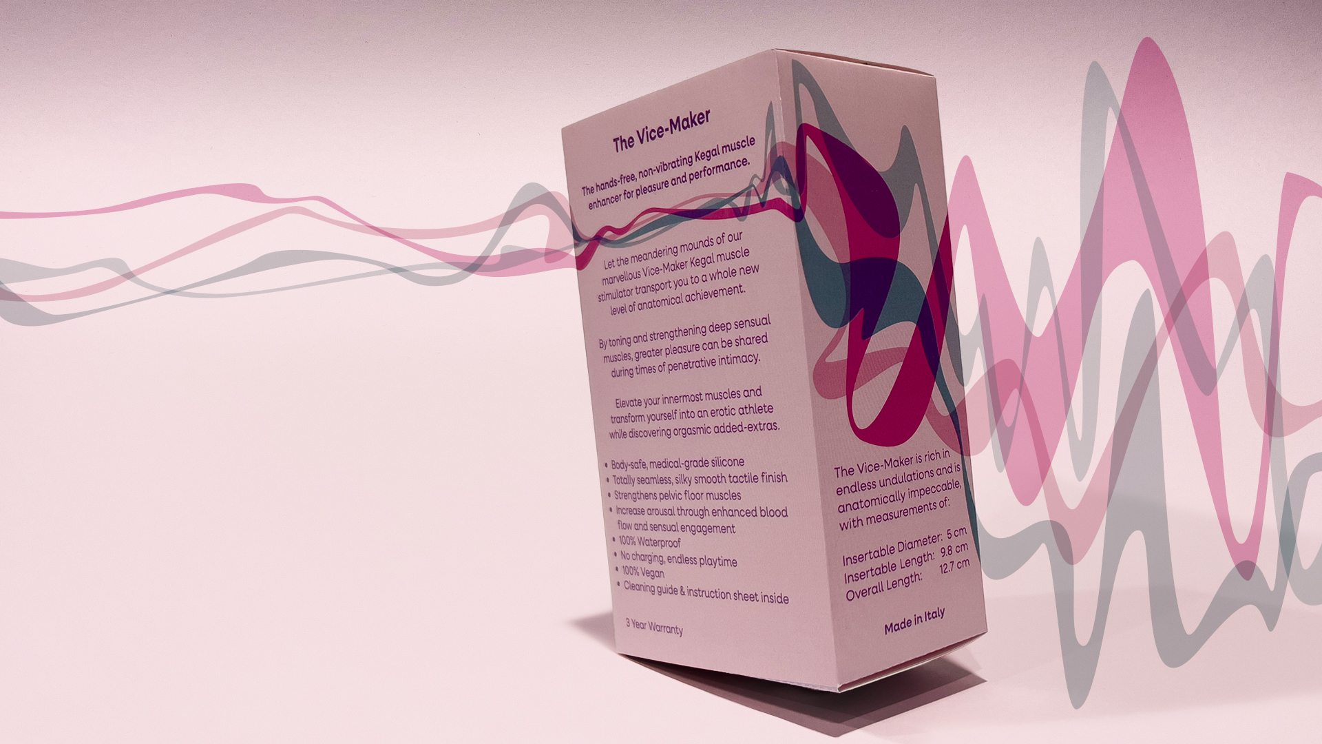
Harmonious Hierarchy: Clear typographic hierarchy and use of negative space guides the eye around the informational elements of the package design, as the meandering coloured curves caress the three-dimensional form.
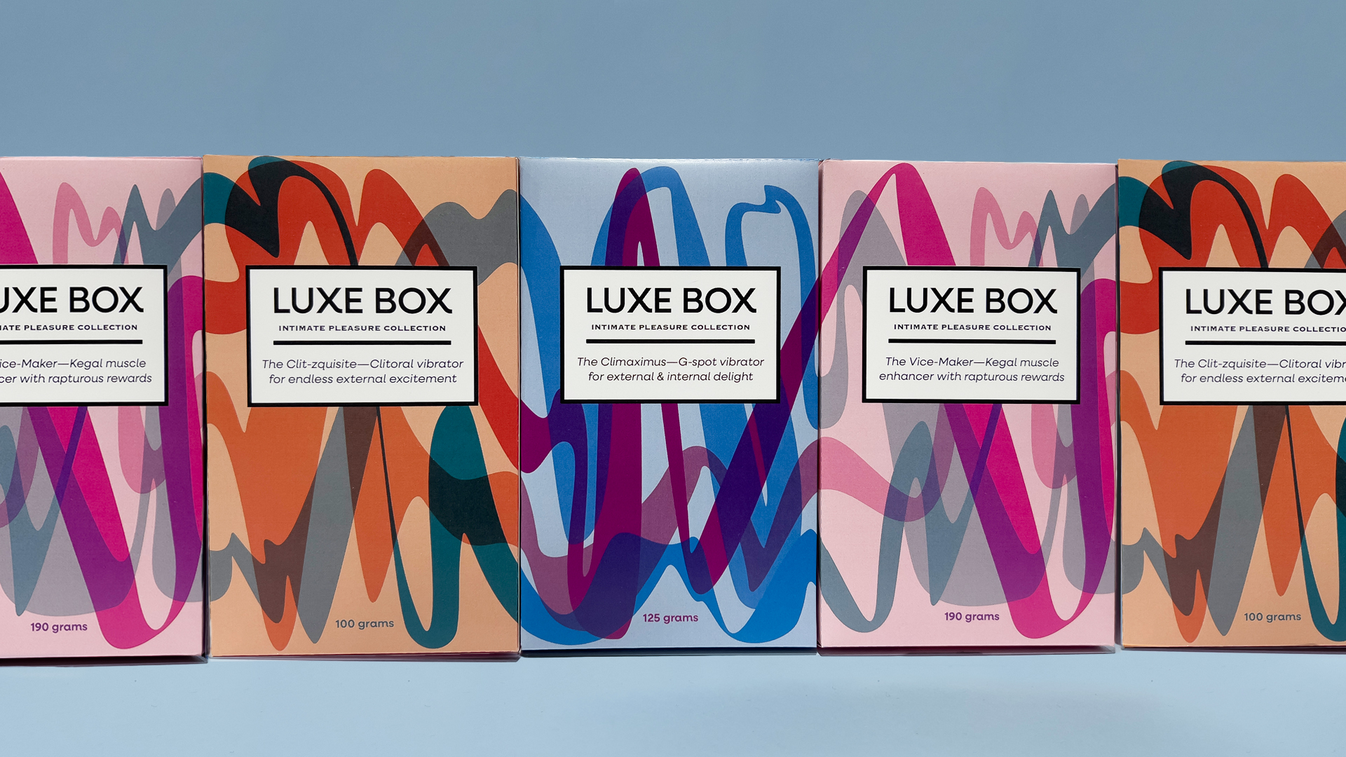
Conscious Connection: Carefully considered surface graphics exploit the use of the overprint effect showcasing visual representations of an harmonious hum right up to an unrestrained rumble, and these connect across each box front, uniting the collection.
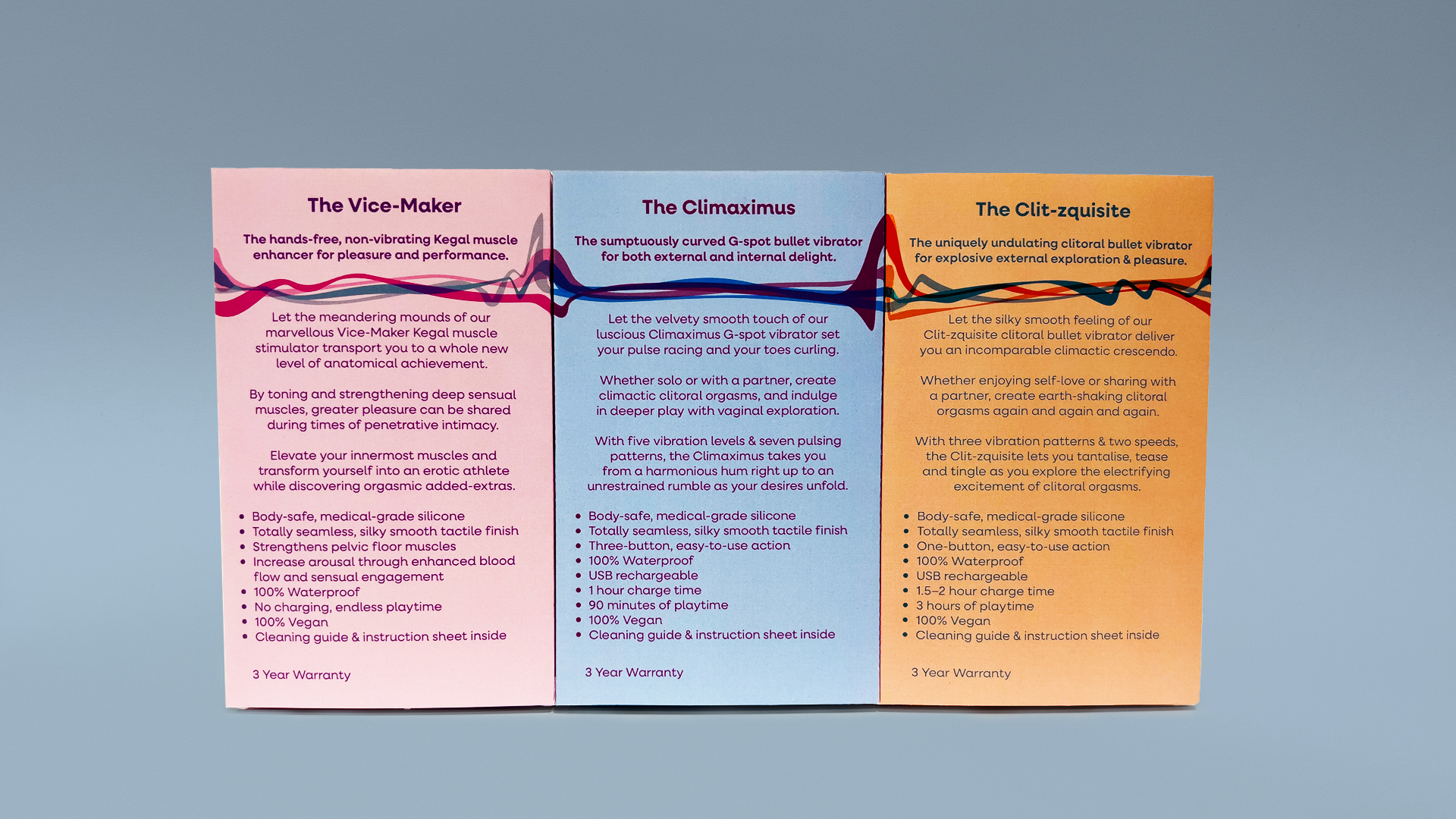
Continuity and Unity: All surfaces of the three-dimensional form were considered, and the same united outcome as the front surface graphics is seen on the back of the packs as all the lines connect seamlessly.
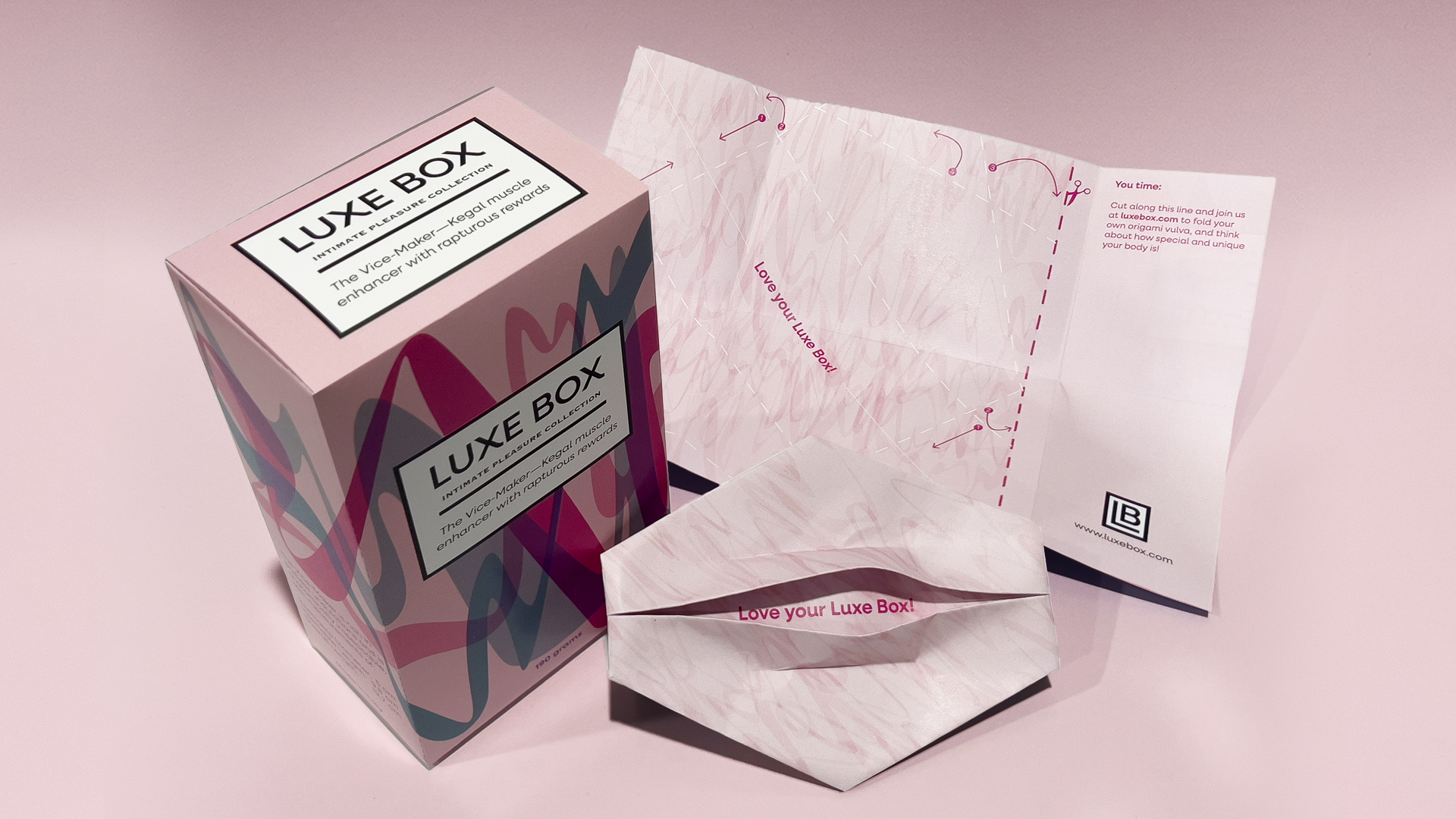
Inner Folded Sheet: An informational sheet conveys how to enjoy and care for each product, and the reverse side of the sheet offers the chance to fold an origami vulva and reflect on how special and unique every person is.
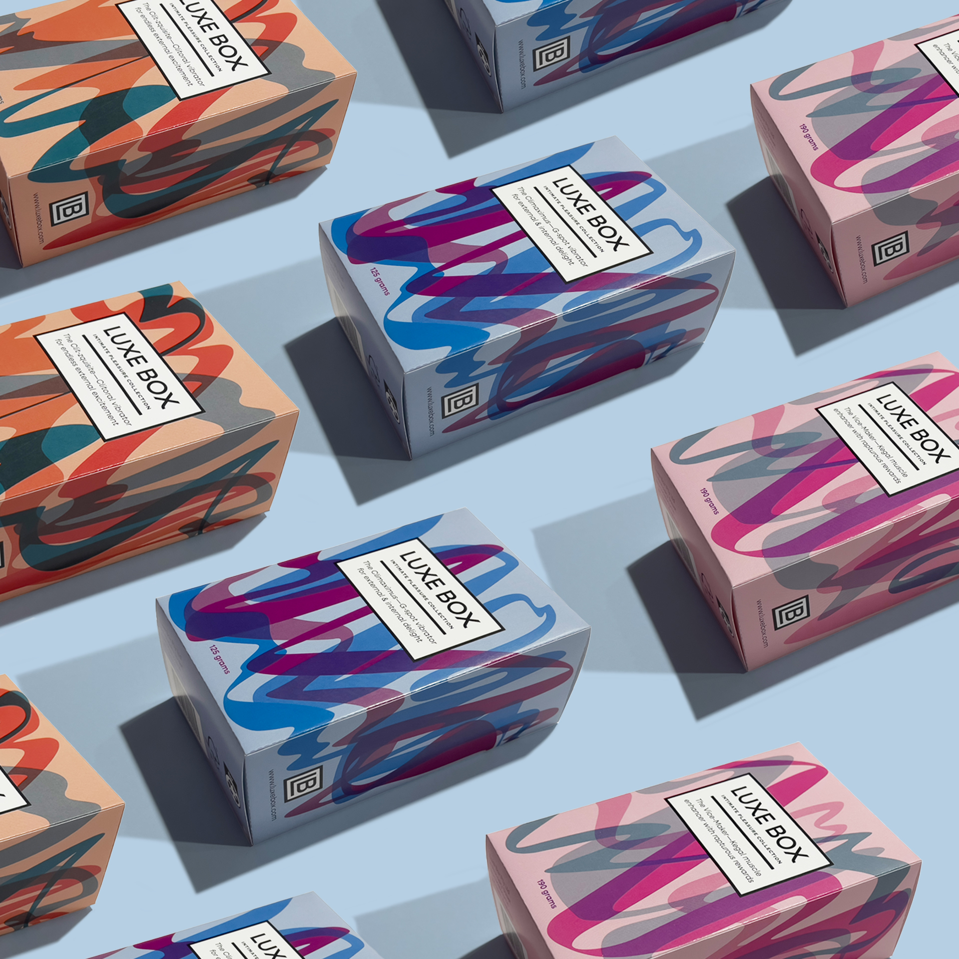
Uniform Yet Unique: By creating visual cohesion across the series through the design of the surface graphics, the trio have the quality of being united yet each has their own identity, reflecting the product within.
References:
Knowledge of the origami vulva:
Bodyform. (2024). Fold your own origami vulva. Essity. https://www.bodyform.co.uk/break-taboos/our-world/fold-your-own-origami-vulva/
