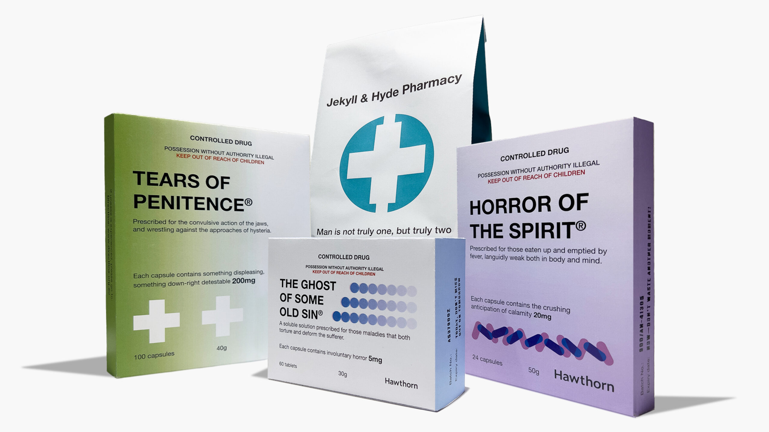
Meaningful messaging in the mundane: While generic pharmaceutical goods are devoid of flashy marketing claims and forceful assertions, they do however communicate a sense of basic necessities being met, arguably as required by a person fulfilling the needs of an addiction. Each item is carefully designed to appear as unassuming as possible, to blend into normality, as could a person who is facing the misuse of substances, evading the knowledge of their loved ones.
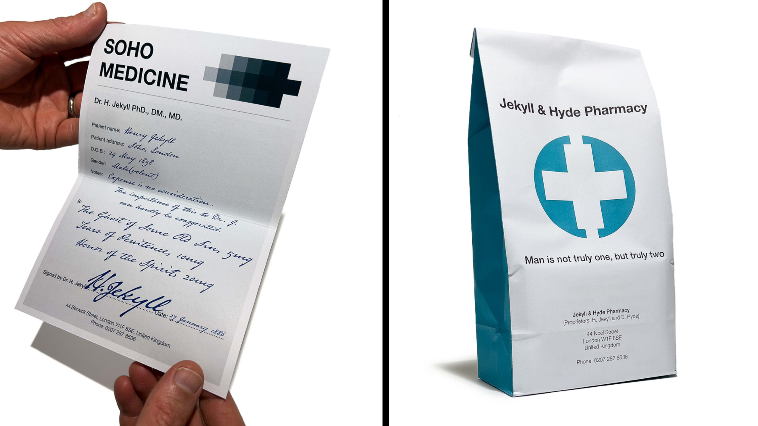
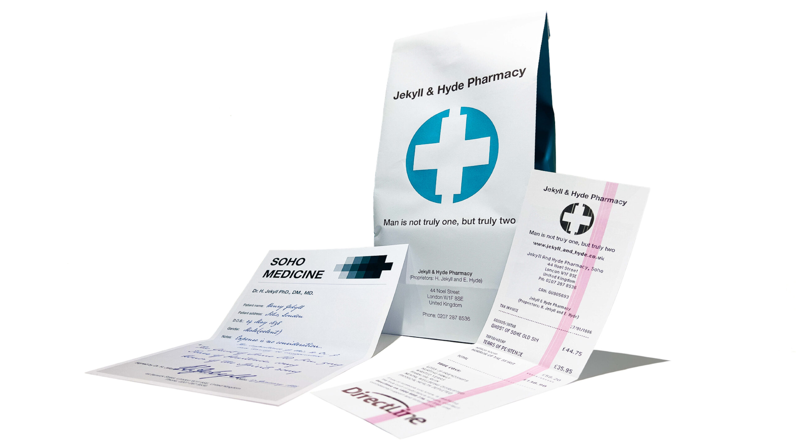
Unwrapping and exploring: The pharmacy bag is the first connection to the concept, and it offers an intriguing package to unwrap. The prescription gives hints that this immersive communication experience offers compelling complexities to comtemplate.
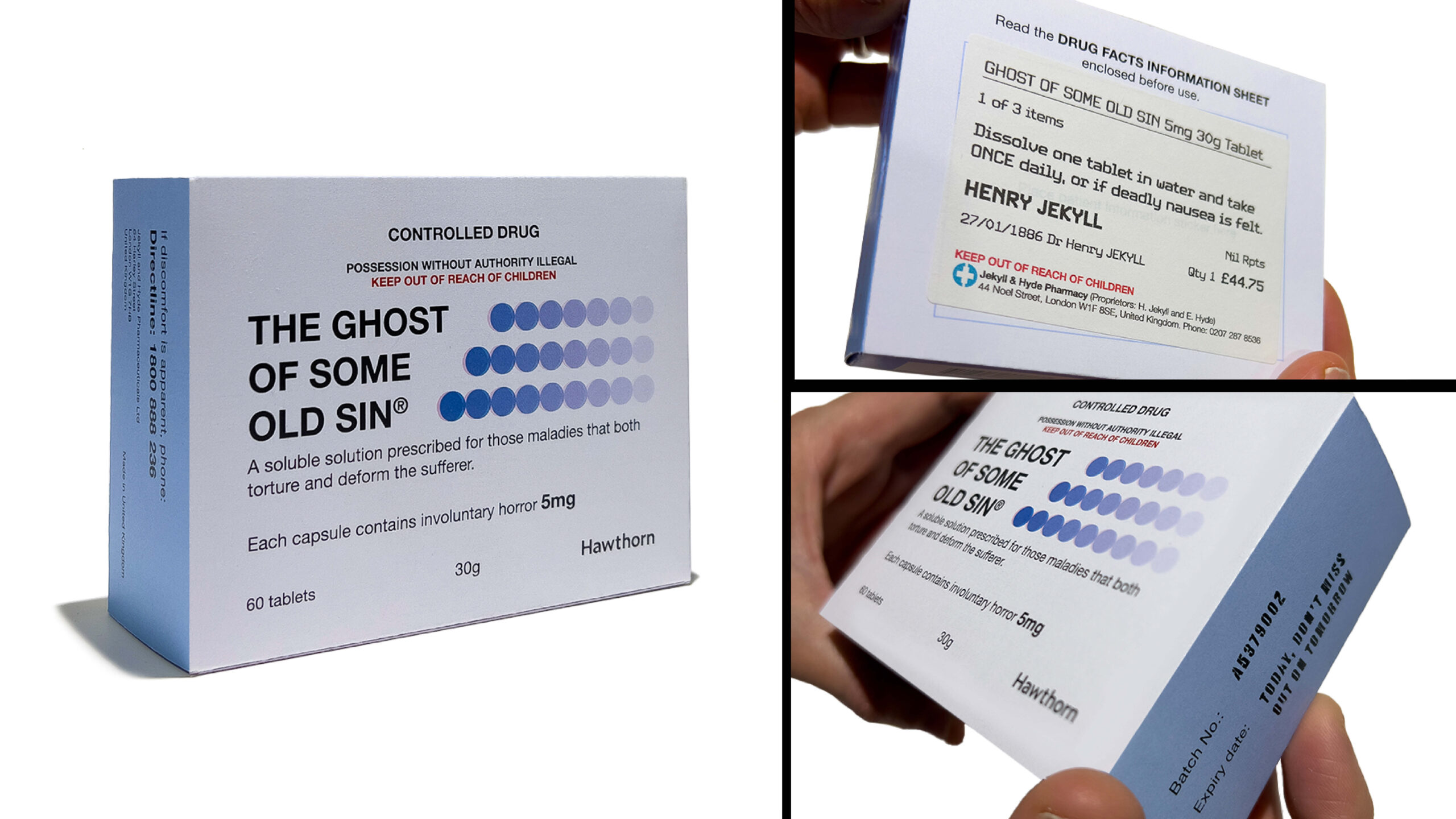
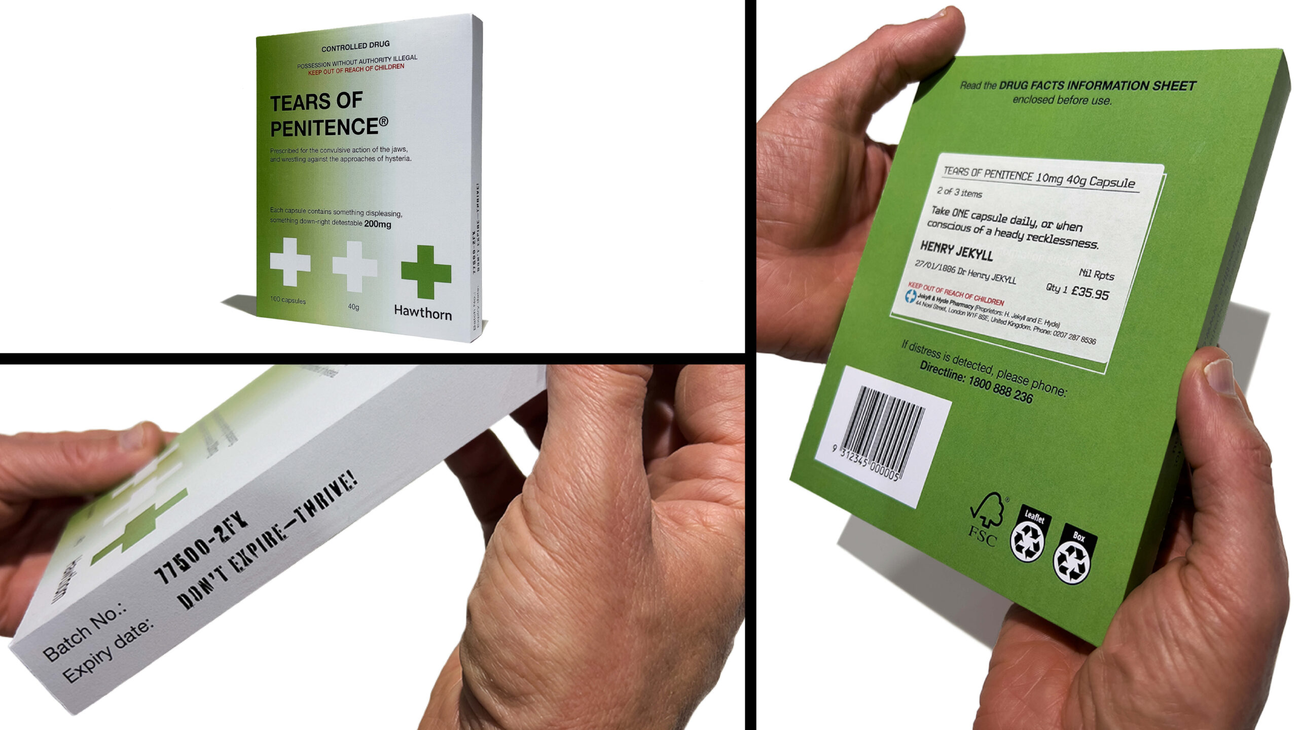
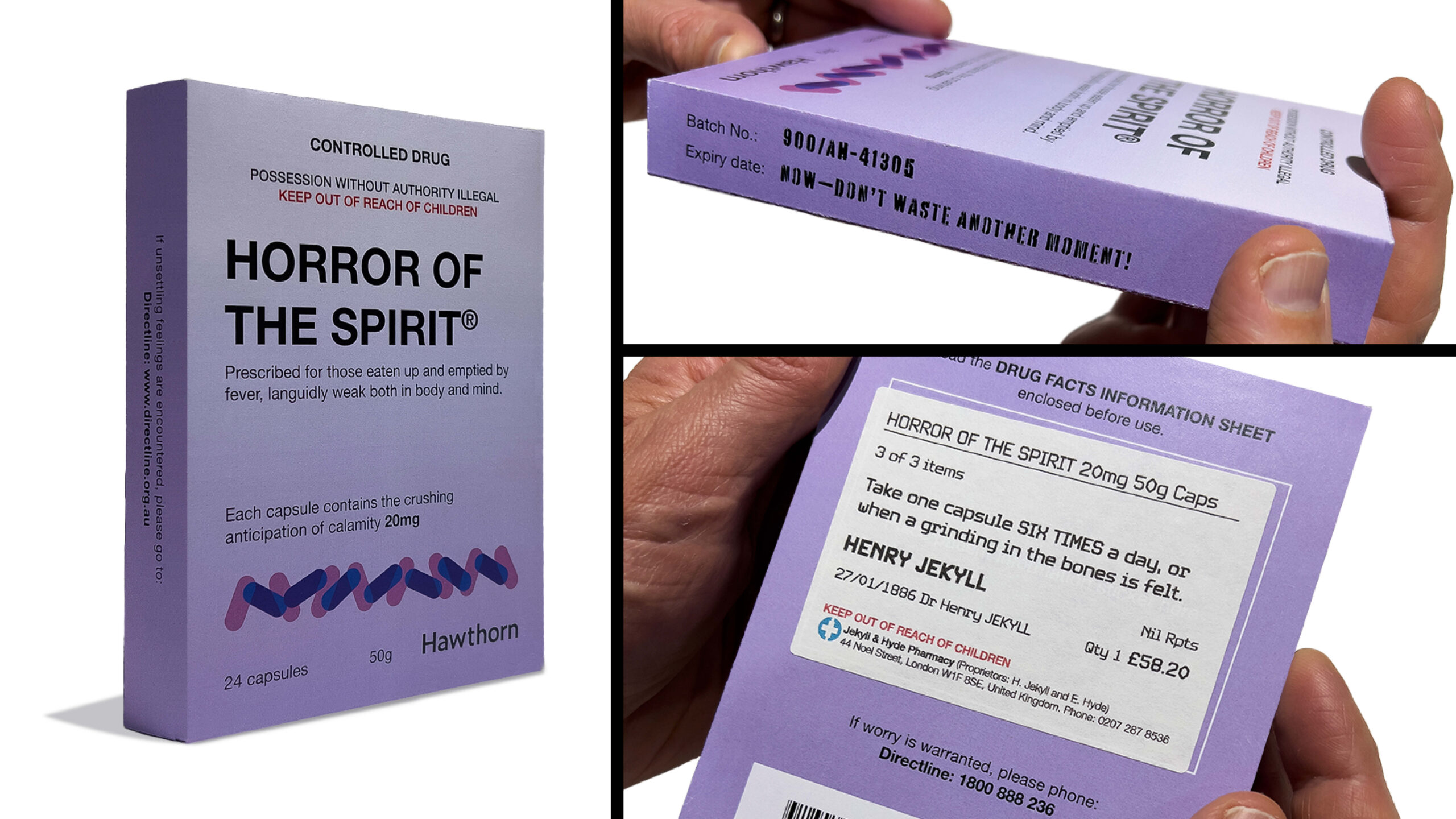
Mysterious medicines: Upon more deeply engaging with the elements of the package, the reader discovers that the items differ from the ordinary. Each facet of each element has been designed to convey curated kernels of Robert Louis Stevenson’s novella Strange Case of Dr. Jekyll and Mr. Hyde to stimulate curiosity, evoke thought and reflection, and deliver the reader to the Directline support contact details.
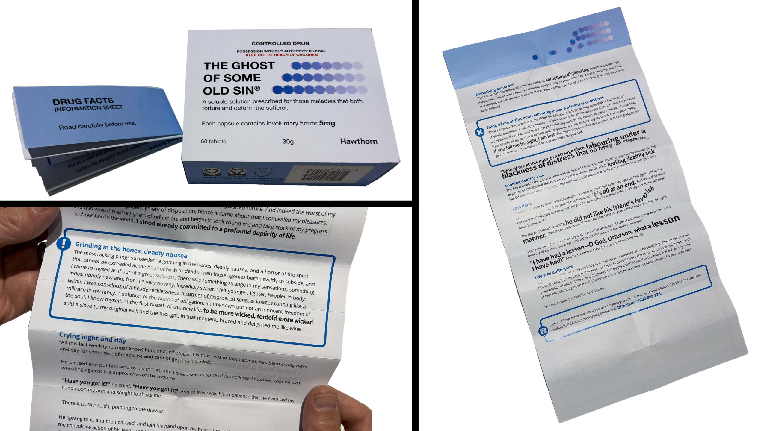
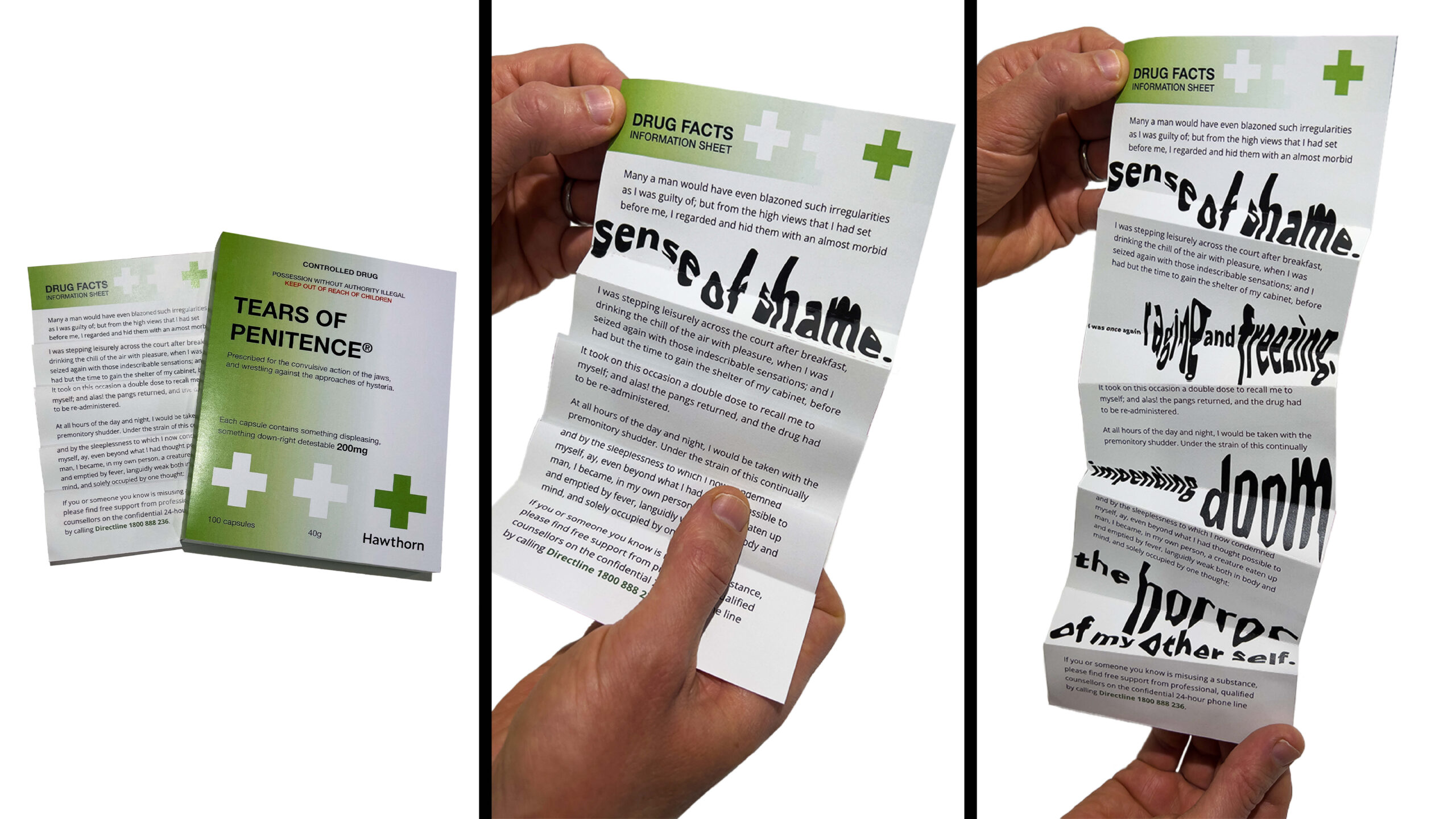
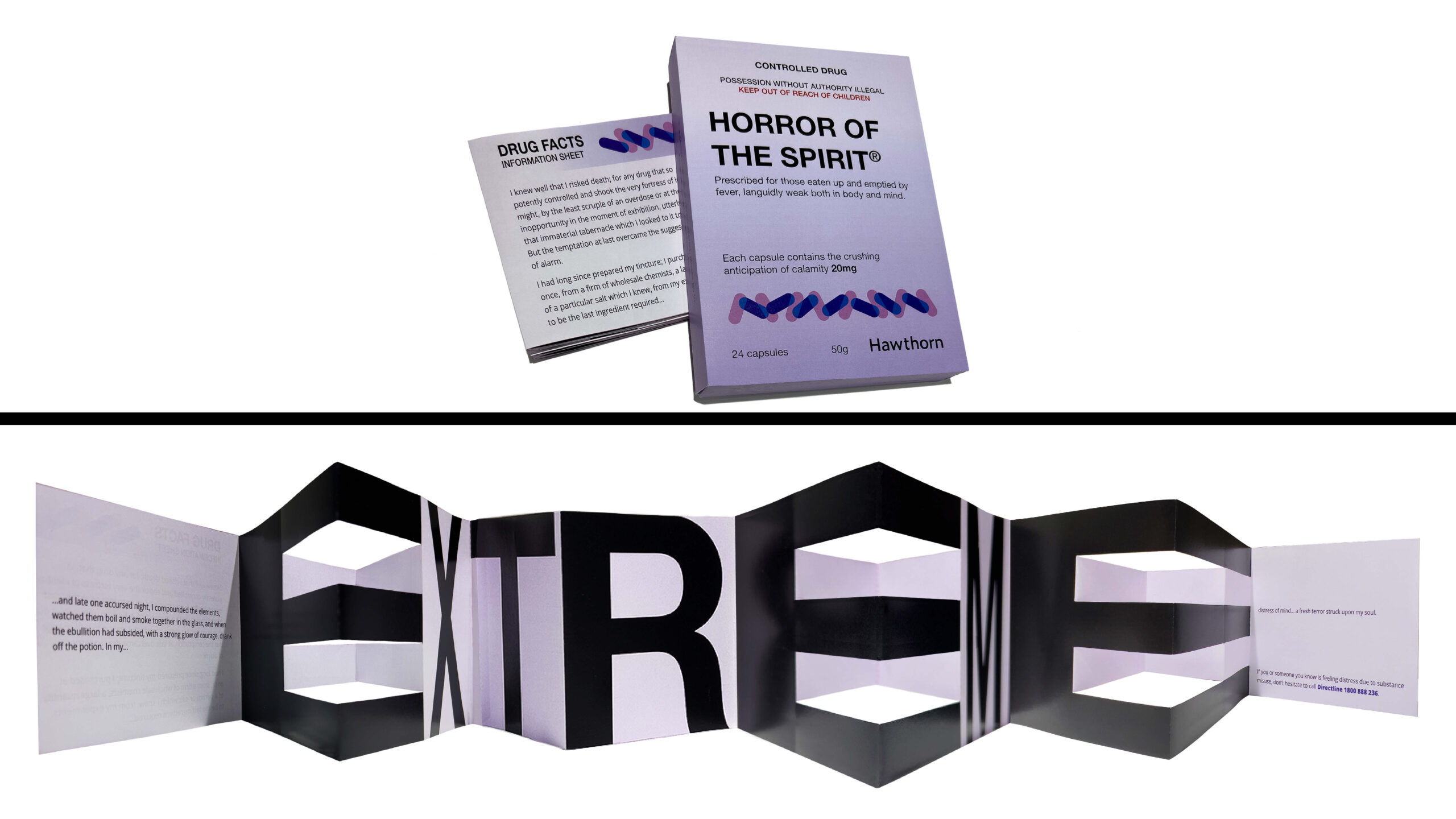
Foreboding folds: Each medicine box contains a drug facts information sheet, which at first glance appears to be a dry and dreary ‘small-print’ executed in a lifeless, utilitarian typeface. However, on closer inspection, and upon unfurling each fold, the use of irregular typeforms communicates the ever-present horror of the feelings and symptoms of substance misuse.
Hidden in plain sight: While very much inspired by ordinary-looking medicine packaging, this communication experience features curated excerpts from the classic work by Robert Louis Stevenson Strange Case of Dr. Jekyll and Mr. Hyde to trigger thought and reflection and deliver the reader to the Directline support network.
Tempestuous Typography: Expressive type provokes the reader to reach out to Directline for support if the ideas revealed in the novella feel as real today as they could have seemed in the late 1800s when Stevenson penned this literary masterwork expertly exploring the struggles of substance misuse.
Always Read the Labels: While the elements of this design solution are simple in their construction, and ostensibly ubiquitous in their typographic design, they offer a divorce from the starchy formality of Victorian societal connections, and the curly, outlined, typefaces thick with drop shadows and over-crowding synonymous with late 1800s communication design.
Seeing the Potential: Through experimenting with physical paper and card mockups, the possibilities were harnessed, leading to a truly powerful unity of typography and the printed form.
Innovative and Conceptual: By engaging deeply with the literary work Robert Louis Stevenson’s novella Strange Case of Dr. Jekyll and Mr. Hyde, unexpected connections were made to the unassuming communication on generic medicine packaging. Despite appearing at first glance to be mundanity itself, upon closer inspection, irregularities are revealed.
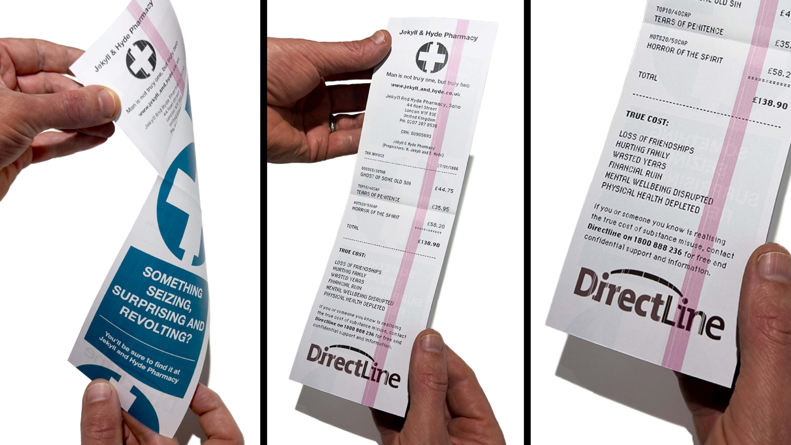
The True Cost: The faded pink line is added to the receipt as this indicates that the roll of paper in the cash register is coming to an end, this is a visual metaphor expressing that life is finite and that making the most of each moment is precious.
References:
Directline logo:
DirectLine. (2025). Directline logo [Image]. https://www.directline.org.au/