Record Cover Redesign:
Skream! by Skream
IDA INTERNATIONAL DESIGN AWARDS 2025:
Bronze Winner:
Advertising/Promotion—Record Cover/Artwork
C2A CREATIVE COMMUNICATION AWARD 2025:
Winner:
Packaging—Limited Edition
Winner:
Other Graphic Design—All Other Graphic Design
LICC LONDON INTERNATIONAL CREATIVE COMPETITION 2024:
Shortlisted:
Illustrate (Graphic)—Packaging


What frankreative made: 12″ Double record album cover and record label stickers
What frankreative did: Research into sociocultural context, Design Conception, Photography, Photo Compositing, Brand Identity Design, Typesetting, Art Direction
Client: Swinburne University of Technology Assignment, 2023
The Brief: The record cover redesign brief requested experimental image-making techniques be explored to create a visual manifestation reflecting the aural themes of the chosen album. Surface graphics were to flow across all facets of the form and concept, branding, image design were to be totally original.
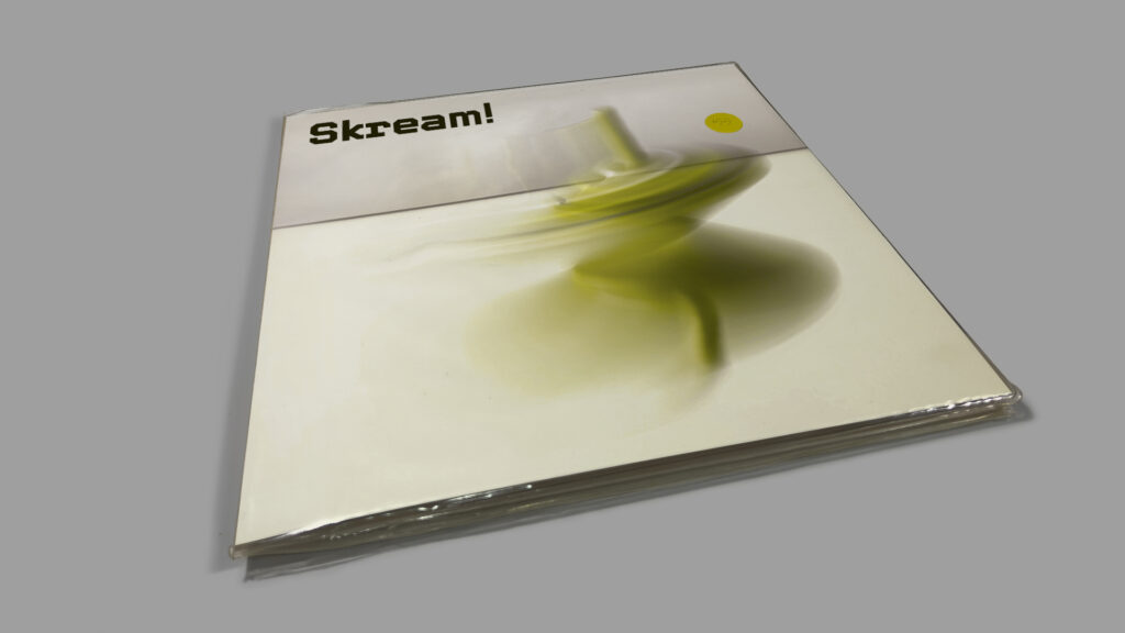
The spiralling top whirs with energy, careering towards the right side of the frame, ratcheting up the tension and beckoning the cover to be opened.
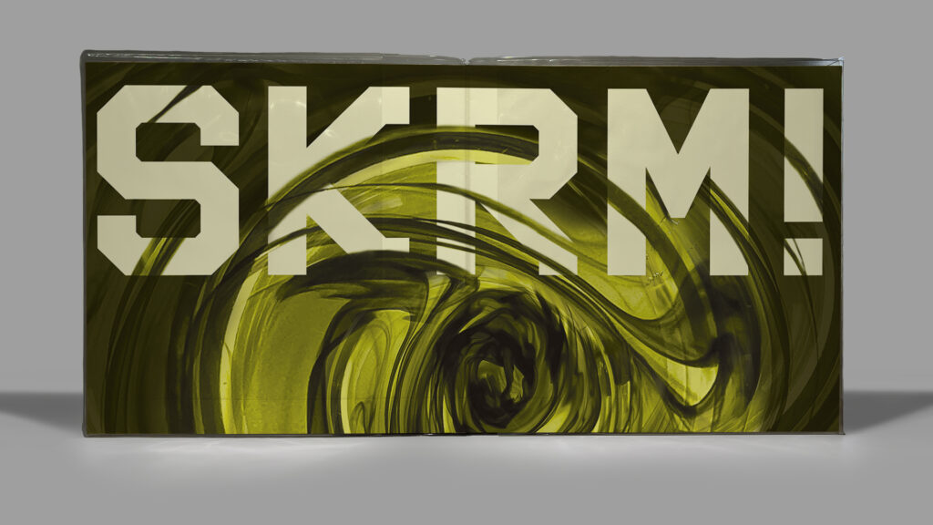
The abbreviated SKRM! text speaks to a digitally-connected audience, and the sturdy slab serif conveys a self-assuredness, as both the artist and the album have stood test of time.
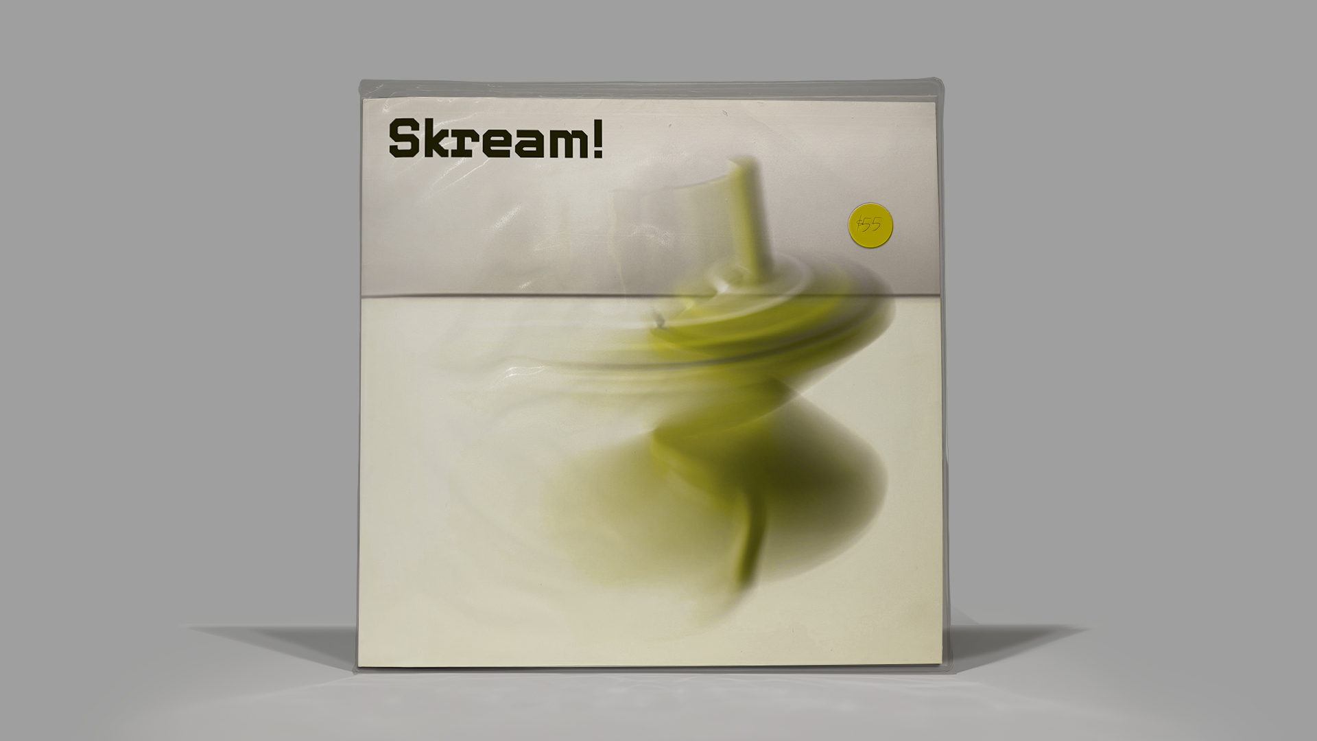
Front Cover: Upon viewing the front cover, the sinister aural themes are immediately communicated through the murky acid green and black, connecting to aposematic animal colourations which humans recognise as a warning signal.
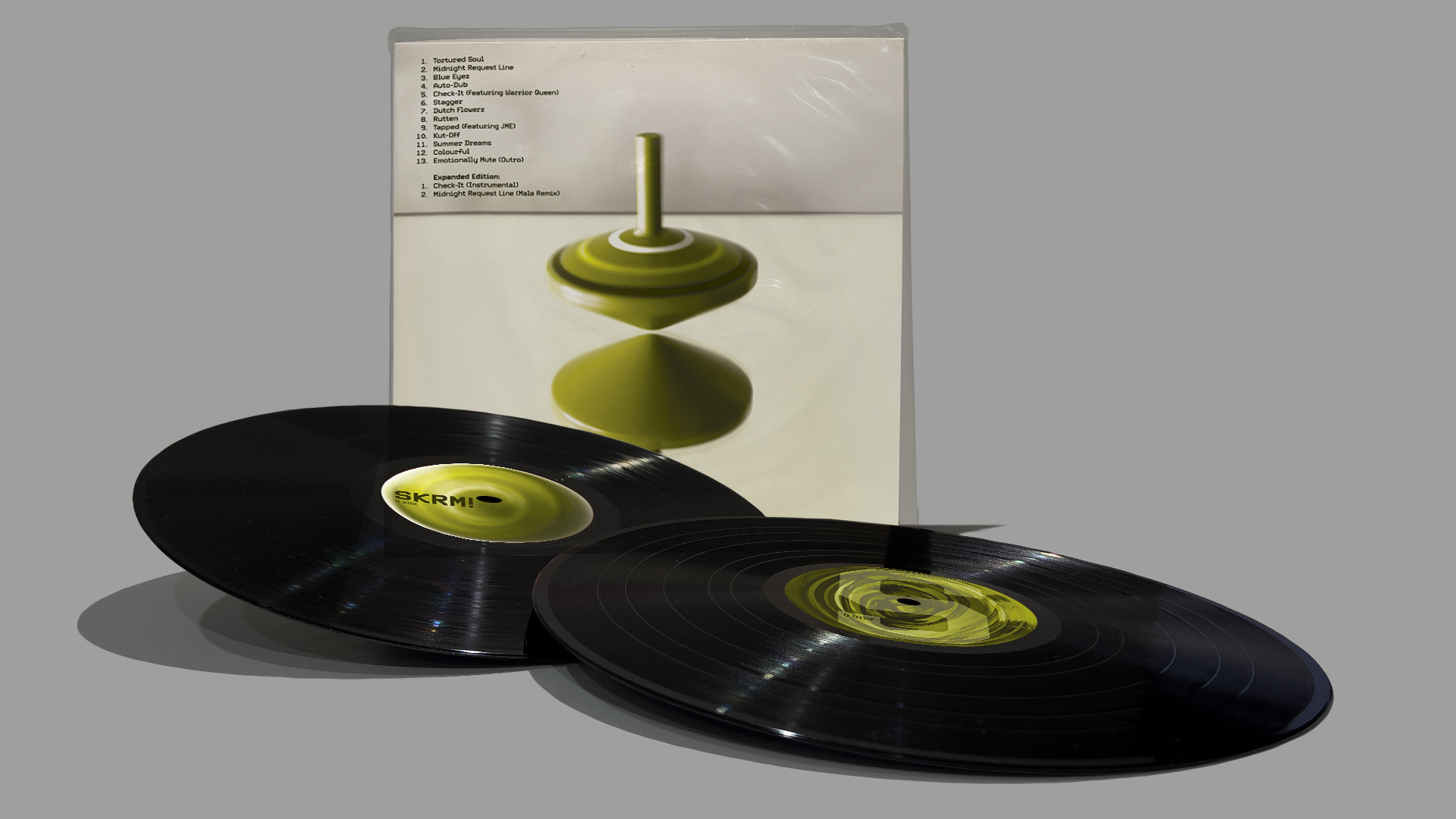
Back Cover and Two Record Labels: Contrasts are expressed when journeying from the light front cover to the dark, foreboding inside gatefold. This reflects the aural experience of the album, with its bright trilling flutes chirping in unison with dark, doom-riddled churning.
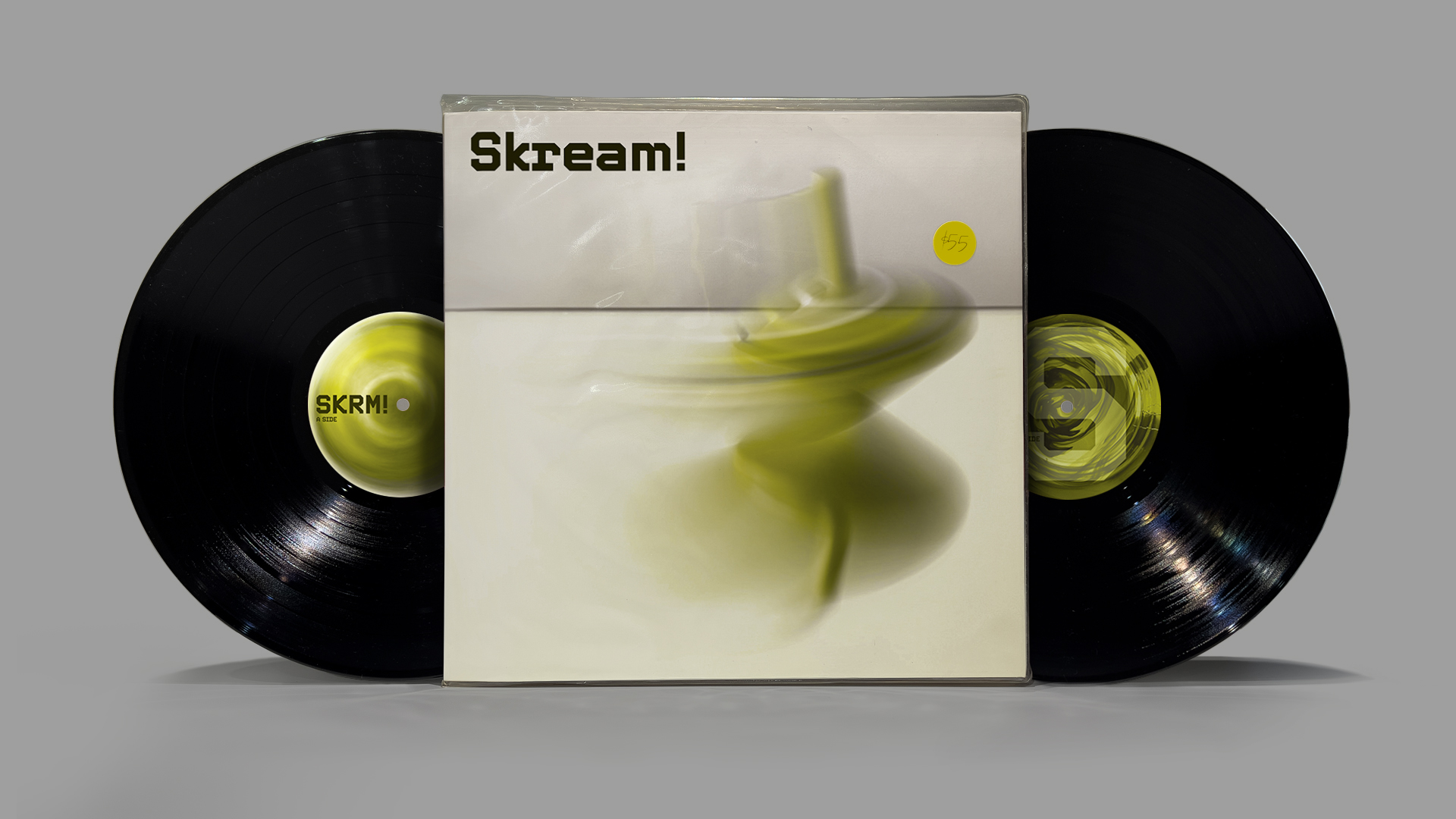
Front Cover and Two Record Labels: The visual representation of the sonic experience extends to the two label designs.
As the record rotates, the A-side depicts the top in the throes of fast motion. The sense of dire spiralling is literally experienced by the viewer, as the eye attempts to focus on the graphic asset, SKRM!. In doing so the viewer feels the signature sonic motif of the album—the churning disquiet.
Additionally, as the record turns, the B-side ‘S’ brand extension exhibits its natural tendency to spin on itself, continuing the narrative.
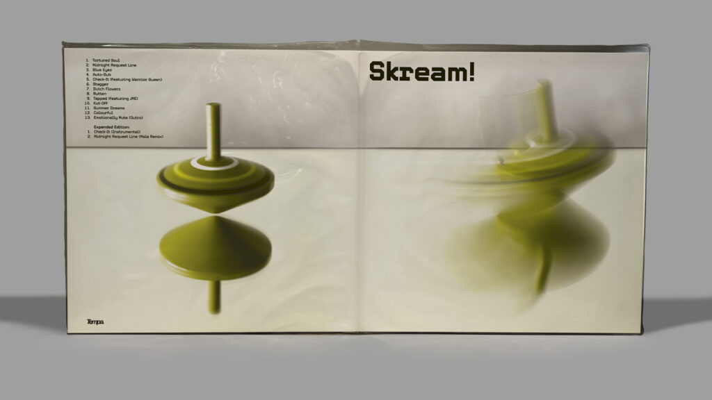
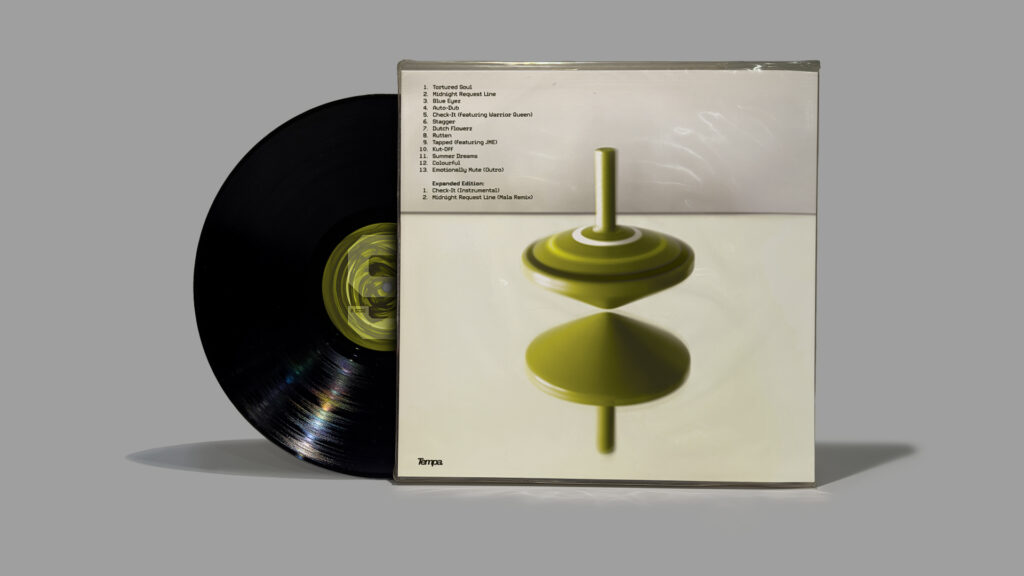
Back Cover and Record: Digital photography, later manipulated in Adobe Photoshop, connected to Skream’s digital music production. Both long exposure and fast shutter modes captured the revolving movement delivering effects which represented the aural experience of the album. As the drama of the inside artwork is digested, the back cover communicates a sensation of completion, as it mirrors the front cover treatment.
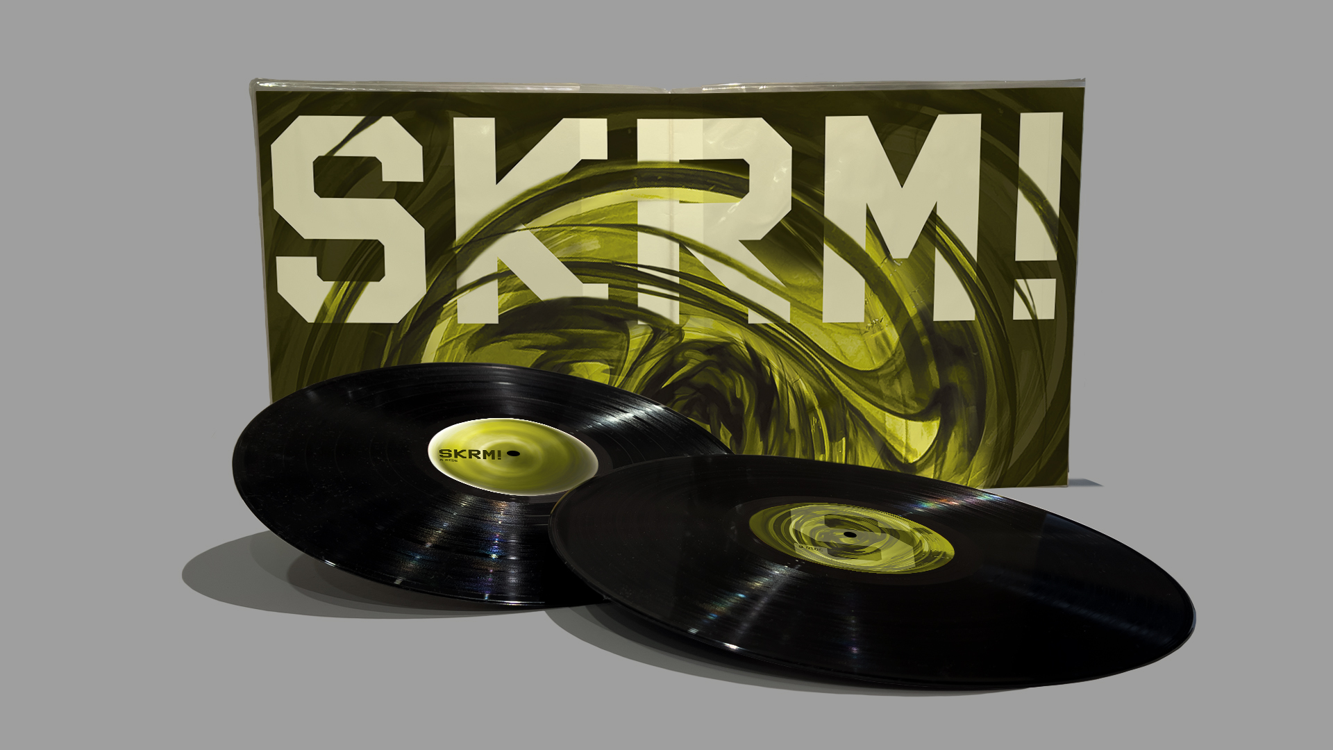
Inside Cover (Gatefold) and Record labels: The proposed primary target market witnessed the sub-genre’s inception, and are nostalgic Dubstep fans eager to celebrate the re-release of this seminal album. A secondary target market are a younger, digitally-savvy audience who discovered Skream through social media, radio shows and global tours.
Arguably both target audiences have divisive world news at their fingertips and consume tension-rich media, contributing to a cynical world view. Therefore, Skream’s 2006 tracks like ‘Tapped’, ‘Tortured Soul’ and ‘Midnight Request Line’, which are thick with Orwellian doom, conceivably reflect a fraught society now, as astutely as they did nearly two decades ago.
References:
Skream! album title and tracklisting:
Skream. (2006). Skream! [Album]. Tempa.
Tempa logo from:
Tempa logo [Image]. Discogs. https://www.discogs.com/label/6170-Tempa?
